
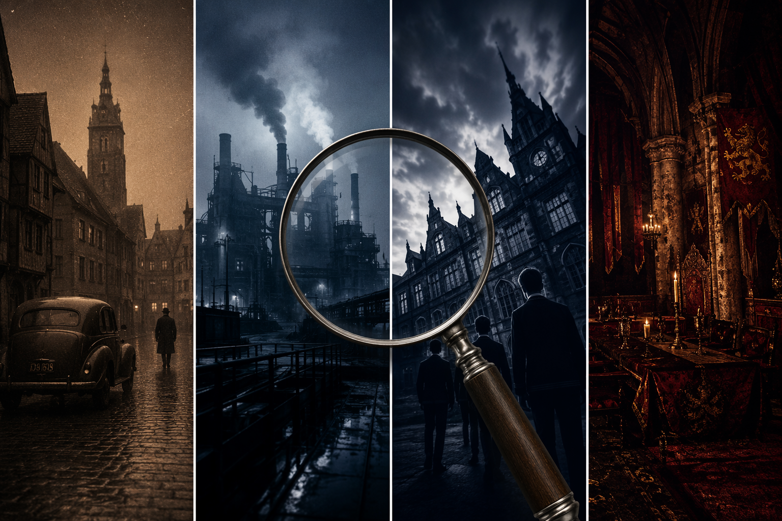
Analyzing the Visual Language of Netflix Dark Fantasy
This article provides a comparative framework for analyzing the distinct visual strategies of Netflix's dark fantasy originals—Dark, Wednesday, The Witcher, and Castlevania—helping film studies students identify and articulate the cinematographic choices that define each series.
Updated:
A student looking at Netflix dark fantasy has an understandable first reaction: the screen is dark, the buildings are old, the music broods, and everyone seems to be walking toward trouble. That is enough for a viewing note, but not for a film-studies paragraph. “Dark” names an impression. Analysis has to name the mechanism.
The genre itself gives us a useful starting boundary. Dark fantasy has been described through Brian Stableford’s framing as a “borderland between horror and fantasy,” which is helpful because it keeps two pressures in view at once: fantasy’s world-building and horror’s threat, decay, or dread.[1] But the borderland does not look the same from one series to another. In Netflix’s Dark, Wednesday, Castlevania, and The Witcher, darkness is not a single house style. It is organized through different visual systems.
Start With What the Image Is Doing
For a comparative essay, the first useful move is to stop treating tone as decoration. A dark-fantasy image can orient the viewer in time, sell a platform identity, heighten bodily impact, or fail to match the story-world’s material expectations. Those are different functions, and they need different evidence.
A workable sentence does not simply say that a show “uses gothic visuals.” It identifies a choice, locates it in the frame or workflow, and explains its effect. Color grade, camera sensor, lighting ratio, angle, background architecture, animation timing, costume contrast, and music can all be evidence, but only if the paragraph says what they help the viewer understand.
| Series | Dominant visual problem | Evidence to examine | Analytical payoff |
|---|---|---|---|
| Dark | How to guide viewers through non-linear time | Time-period color palettes, low-light camera workflow, shadow detail | Style becomes narrative navigation |
| Wednesday | How to make gothic identity instantly legible | Blue-black-white palette, Dutch angles, Nevermore Academy, Danny Elfman’s musical mood | Style becomes genre branding |
| Castlevania | How animation builds dark fantasy through bodies and architecture | Character design, anime-style fight choreography, gothic backgrounds | Style becomes kinetic and spatial design |
| The Witcher | How polish can conflict with expected texture | Clean digital cinematography, medieval fantasy surfaces, audience criticism | Style becomes a caution about tonal fit |
Dark: Color as a Time Machine
Dark is the strongest place to begin a Netflix dark fantasy analysis for film studies because its visual language does not merely create atmosphere. It performs a narrational job. In a story built around multiple periods and repeated temporal dislocations, the viewer needs more than dialogue to know where they are. The image helps sort chronology.
The color-grade breakdown is unusually clean for teaching purposes: the 1950s are associated with sepia tones, the 1980s with a cool blue palette, 2019–20 with warmer tones, and the post-apocalyptic material with a desaturated look.[2] These palettes are not random variants of “grim.” They are a system of temporal labeling. When the series cuts across time, the grade gives the viewer a first cue before exposition catches up.
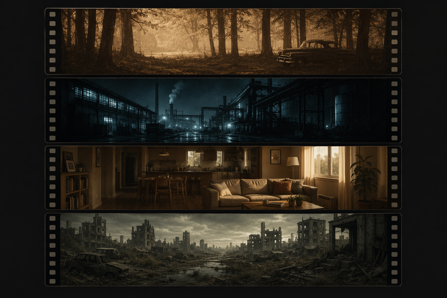
That matters because non-linear storytelling often creates an orientation problem. If every time period were graded in the same generalized charcoal-grey gloom, the viewer would have to do more labor simply to place a scene. Dark’s palette reduces that burden. It lets the spectator read temporal difference before fully processing character age, costume, location, or plot detail.
This is where production workflow becomes more than trivia. Cinematographer Nikolaus Summerer’s choice of the ARRI Alexa, despite Netflix’s preference for RED cameras, is reported as a deliberate decision connected to preserving detail in low-light conditions.[3] That fact gives an essay something sturdier than “the show looks moody.” It shows that the series’ darkness was negotiated at the level of capture, not simply painted over the footage later.
The distinction is important. A low-light image can either reveal darkness or swallow information. Dark needs the former. Its caves, forests, bunkers, and domestic interiors must feel oppressive, but they also have to remain legible because the plot depends on recognition: who is where, which era is being entered, which object or room has returned in altered form. Shadow detail is therefore not just a matter of beauty. It is part of the story’s readability.
A strong paragraph on Dark might therefore connect three layers: the color palette marks time period; the camera workflow protects information inside darkness; the result lets the series sustain temporal confusion without making the frame visually incoherent. That is a more precise claim than saying the show is “cinematic,” a word that often hides the very work it should explain.
Wednesday: Gothic Style as a Recognizable Brand
Wednesday uses darkness differently. It is less invested in helping the viewer navigate chronology and more invested in making gothic identity instantly legible. The series draws on Tim Burton’s signature blue-black-white palette, Dutch-angle compositions, and Danny Elfman’s mood architecture, while Nevermore Academy functions as a gothic space that signals genre allegiance before the plot has to explain itself.[4]
Nevermore is the crucial object here. A school is already a narrative machine: corridors, dormitories, gates, classrooms, social zones, forbidden spaces. Wednesday makes that machine gothic through silhouette, symmetry, shadow, and architectural excess. The building tells the viewer what kind of world this is before a mystery clue or monster encounter arrives.
The blue-black-white palette also clarifies character alignment. Wednesday Addams’ visual identity is so sharply controlled that she can remain visually distinct even when surrounded by other supernatural students, elaborate school spaces, or genre spectacle. In essay terms, the palette does not merely express personality. It stabilizes a central figure inside a crowded fantasy environment.
Dutch angles are easy to overname and underanalyze. It is not enough to point out that the camera tilts. The question is what the tilt does to a space that might otherwise feel too familiar. In Wednesday, skewed compositions help convert school architecture into a mildly unstable gothic playground. The world is not photographed as neutral institutional space; it is made slightly off-axis, as if ordinary adolescence has been re-housed inside a haunted illustration.
The popularity figure belongs here, but only if handled carefully. Wednesday reportedly drew 341.2 million viewing hours in its first week.[5] That number does not prove that the series is formally better than another dark fantasy title. It does show that a coherent gothic identity can travel at enormous scale. The look was readable enough to become part of the show’s circulation, marketing, and recognition.
That is the analytical difference between Dark and Wednesday. Dark’s palette primarily helps viewers organize a difficult narrative structure. Wednesday’s palette and spatial design help viewers recognize a genre personality. Both are dark fantasy, but the darkness has different labor to perform.
Castlevania and the Mistake of Treating Animation as an Add-On
Castlevania should not be tucked into a paragraph after the live-action examples as if animation were only a variation in surface. It changes what counts as visual evidence. In live action, students often reach first for cinematography: lensing, lighting, production design, color grade. In animation, the image is built from different decisions: line, timing, body distortion, impact frames, background design, and the relation between character movement and architectural space.
Powerhouse Animation’s Castlevania has been described as synthesizing Western character design, anime-style fight choreography, and gothic architectural backgrounds.[6] That combination is not a compromise between traditions. It is the show’s visual engine. The gothic castle is not only a setting; it is a graphic field through which bodies slash, leap, collide, and transform.
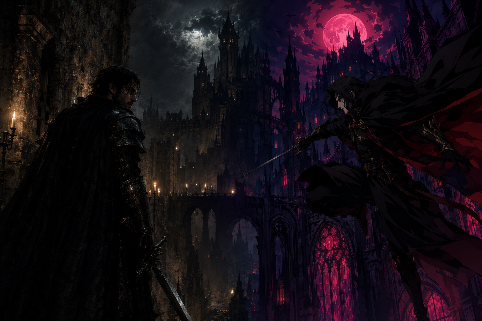
This is where animation can do dark fantasy differently from live action. A live-action fight must negotiate stunt performance, camera placement, physical sets, digital enhancement, and bodily plausibility. An animated fight can stretch anatomy, compress time, exaggerate force, and turn the background into a rhythmic partner. The result is not automatically better, but it is formally distinct.
For essay writing, that means Castlevania should be analyzed through movement as much as palette. A student might track how a fight uses speed changes, silhouettes, arcs of motion, and architectural depth to produce a dark-fantasy body: not just a character in a gloomy world, but a body whose violence and vulnerability are drawn through the medium’s capacity for exaggeration.
The gothic backgrounds matter as well. Castles, chambers, arches, and vertical spaces give the series a historical-fantasy density, but because they are animated, they can be composed with graphic precision around combat. The architecture frames action rather than merely surrounding it. That is a useful contrast with Wednesday’s Nevermore: both rely on gothic space, but one uses it to brand a school world, while the other uses it as a stage for kinetic violence.
The Witcher: When Clean Images Meet Gritty Expectations
The Witcher is useful here as a caution rather than a punching bag. The point is not to settle whether the series is good. The sharper question is why some viewers felt that the first season’s clean digital cinematography undercut the gritty medieval-dark fantasy tone expected from the material.[7]
That criticism is analytically productive because it separates technical competence from tonal fit. A clean image can show costumes, faces, armor, and locations clearly. But in a medieval dark-fantasy world, too much smoothness can work against the sensation of dirt, weather, age, danger, and bodily hardship. Polish is not neutral; it carries genre implications.
The comparison with Dark is especially revealing. Dark’s low-light strategy has to preserve information inside shadow because viewers need orientation. The Witcher’s problem, as framed by the cited criticism, is almost the inverse: the image may be legible while still feeling insufficiently textured for the world it asks viewers to believe in. In one case, darkness must not obscure too much. In the other, clarity may clean away too much.
This gives students a better vocabulary than “it looks too digital.” The claim should specify the mismatch: between surface cleanliness and medieval grime, between high visibility and environmental harshness, between fantasy spectacle and dark-fantasy materiality. Whether one agrees with the criticism or not, it models the right kind of question: does the visual system support the genre world the series is building?
A Comparative Method for Writing About Netflix Dark Fantasy
A good comparative paragraph usually begins with a shared category and then separates the functions. All four series belong near the horror-fantasy borderland, but they do not organize that border in the same way. Dark uses color and shadow to manage temporal complexity. Wednesday uses gothic stylization to make identity and setting immediately legible. Castlevania uses animation to intensify bodies, motion, and architecture. The Witcher shows how a clean visual surface can become controversial when viewers expect rougher medieval texture.
The most reliable method is to move from observation to mechanism to function. Observation: the 1980s sequences in Dark look cool and blue. Mechanism: the series assigns different color grades to different time periods. Function: the viewer receives a visual cue for chronology inside a non-linear narrative. That third step is where analysis begins.
| Question | What to look for | Weak wording | Stronger wording |
|---|---|---|---|
| How is time organized? | Color grade, lighting continuity, period-specific palette | Dark looks gloomy. | Dark uses distinct palettes to help viewers identify time periods. |
| How is genre announced? | Architecture, costume contrast, camera angle, musical mood | Wednesday is gothic. | Wednesday turns school space into a gothic brand through palette, angle, and design. |
| How does the medium shape the body? | Animation timing, combat rhythm, silhouettes, exaggeration | Castlevania looks like anime. | Castlevania uses anime-style fight choreography to make violence graphic, rhythmic, and architectural. |
| How does texture support or weaken tone? | Digital cleanliness, dirt, grain, weathering, surface detail | The Witcher looks fake. | The Witcher’s clean digital look can be read as conflicting with expectations of medieval grit. |
The same method works at the level of a single shot. First, name what is visible without inflating it: a cool palette, a tilted frame, a silhouetted body, a polished surface. Then identify the craft category: color grade, composition, animation timing, production design, camera workflow. Finally, explain the consequence for narrative, genre, or platform identity. If the consequence is not clear, the observation may not yet be evidence.
It also helps to avoid ranking language unless the assignment asks for evaluation. “Dark is better than Wednesday” is less useful than “Dark’s palette solves a narrative-orientation problem, while Wednesday’s palette consolidates gothic brand recognition.” The second sentence can be argued from evidence. The first often becomes taste dressed as analysis.
The selection here is exemplary rather than exhaustive. A broader survey of Netflix dark fantasy would have room for The Sandman, The Dark Crystal: Age of Resistance, and Castlevania: Nocturne. But the four cases above are enough to establish the central lesson: Netflix dark fantasy is not one visual look. It is a set of distinct strategies, and the strongest writing names the mechanism, identifies the evidence, and explains what the image does.
References
- Dark fantasy, Wikipedia.
- Dark cinematography analysis, Big3 Media.
- Dark production details, Wikipedia.
- Wednesday review, Macquarie University Lighthouse.
- Wednesday review, NOFS Podcast.
- Castlevania analysis, Digital Trends.
- The Witcher first-season visual criticism, Reddit analysis cited in the research draft.
Comments
Join the discussion with an anonymous comment.