
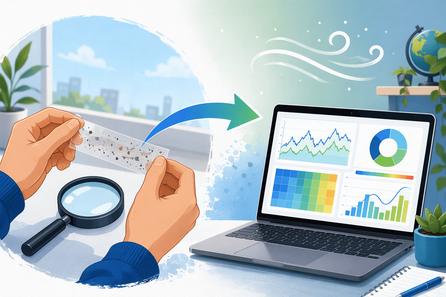
How to Use Air Quality Data for a Science Project
A step-by-step guide that starts with free, hands-on observation methods (sticky tape tests, lichen surveys) and progresses to analyzing open datasets from OpenAQ and EPA AirNow—giving students a complete, judge-worthy project without expensive sensors or coding experience.
Updated:
If you are trying to figure out how to use air quality data for science projects, start with something you can see, touch, repeat, and explain. You do not need a paid sensor, a coding class, or a giant spreadsheet on day one. A good project can begin with a strip of clear tape near a bus lane, a photo of the sky at the same time each afternoon, or a lichen survey on trees around your school.
Those first observations are not the whole project. They are the way into the project. Once you notice a pattern, you can turn it into a question, connect it to public air quality data, make one or two clear charts, and write a conclusion that says what your evidence supports without pretending it proves more than it does.
Start With An Observation You Can Repeat
A science fair judge can forgive simple materials. They are much less forgiving when the method changes every five minutes. Before looking for a dataset, choose one low-cost observation method and make it repeatable.
AirGradient’s student experiment guide includes zero-cost or very low-cost ways to observe air quality, including sticky tape particle collection, visibility checks, blue sky observations, and lichen observation.[1] These are useful because they make air quality local. Instead of beginning with an abstract number, you begin with a place: the sidewalk near pickup, the back field, the classroom window, the parking lot, or the trees along a road.
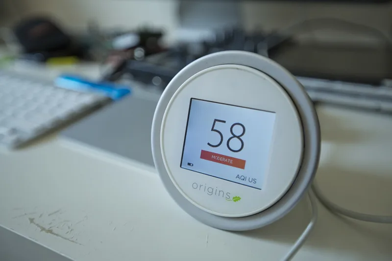
For a first project, the sticky tape test is often the easiest to control. Put a strip of clear tape sticky-side up or press it onto a surface after a set exposure period, then compare what collected on it. The important part is not that the tape gives you an official pollution measurement. It does not. The important part is that it gives you a consistent way to compare locations.
| Observation method | What you compare | What it can help you ask |
|---|---|---|
| Sticky tape particle test | Amount or appearance of collected dust at different locations | Do areas closer to traffic collect more visible particles? |
| Blue sky observation | How clear or hazy the sky looks at the same time on different days | Do hazier-looking days line up with higher public AQI readings? |
| Visibility check | How clearly a distant object can be seen from the same spot | Does visibility change on days with different reported air quality? |
| Lichen observation | Presence or absence of lichen on trees in different areas | Do trees near heavier traffic show different lichen patterns than trees farther away? |
Do not try to make these observations measure more than they can. A tape strip is not a laboratory-grade particle monitor. A blue sky photo is not a chemical analysis. But both can help you build a real comparison, and that is where a project starts to become serious.
Turn The Observation Into A Testable Question
The question should name a place, a comparison, and a type of evidence. “Air pollution is bad” is too broad. “Does nearby traffic affect air quality at my school?” is better, but it still needs a method. A stronger version is: “Do locations closer to the school bus lane collect more visible particles on sticky tape than locations farther from traffic, and do those observation days line up with local AQI data?”
That question gives you two kinds of evidence. First, you have your own field observations. Second, you have public air quality data from a monitoring network. The project becomes more than “I saw dust,” but it still begins with something a student can actually do.
- Weak question: Is the air at my school polluted?
- Better question: Do sticky tape samples near the bus lane collect more visible particles than samples behind the gym?
- Best project question: Do sticky tape samples near the bus lane collect more visible particles than samples behind the gym, and how do those observation days compare with local AQI readings from a public dataset?
This is also the moment to set boundaries. Choose two or three locations, not twelve. Choose one time of day if you can. Use the same tape size, the same exposure time, and the same photo setup. If you change too many things, you will not know whether the difference came from air quality, wind, timing, surface texture, or your own method.
Build A Simple Collection Plan
For the traffic example, a one-week plan is enough to get started. It will not prove a long-term health effect, and it should not claim to. It can show whether your local observations differ by location during your collection period.
| Project choice | Simple version that works |
|---|---|
| Locations | One spot near traffic, one spot away from traffic, and one optional middle-distance spot |
| Time | Same time each day, or as close as your schedule allows |
| Materials | Clear tape, index cards or paper, labels, phone camera, notebook or spreadsheet |
| Record keeping | Date, time, location, weather note, traffic note, photo file name, and what you observed |
| Main comparison | Visible particle buildup on tape by location |
| Public data comparison | AQI or pollutant readings from the nearest available public monitor for the same dates |
Label everything before you collect. “Tape 1” and “Tape 2” will make sense for about ten minutes. “Bus lane, Monday, 3:30 p.m.” will still make sense when you are building the display board.
When you photograph the tape, use the same background and lighting as much as possible. If you have a magnifying glass or a phone macro setting, fine. If not, a consistent phone photo is still better than an impressive-looking photo setup that changes each day.
Add Public Air Quality Data
After you have a question and a collection plan, public datasets become useful. They give your project context. They do not replace your local observations, and they may not measure the exact air at your school fence. Most public monitors are placed for regional monitoring, not for your specific tape strip. That limitation is not a project failure. It is something to explain.
OpenAQ
OpenAQ aggregates air quality data from hundreds of global sources and provides access through a unified, free API.[2] For a student project, the important feature is not the API itself. The important feature is that OpenAQ can help you find air quality measurements near a city or region and compare readings across dates.
If you are not ready to use an API, do not start there. First find whether there are nearby measurements, what pollutants are available, and whether the dates match your observation period. A small, understandable dataset beats a huge file that nobody on the project team can explain.
EPA AirNow
For students in the United States, Canada, or Mexico, EPA AirNow is often the most practical place to look next. The AirNow API provides free real-time and historical data from more than 2,500 monitoring stations across those three countries.[3] If your project uses AQI, AirNow is a natural source to check.
For the school traffic project, you might collect your tape samples for several days, then look up the AQI readings for the nearest available AirNow station during the same period. Your chart can show whether days with more visible particles on your tape also happened to be days with higher AQI. That is a comparison, not proof that the bus lane caused the regional AQI reading.
UCI Air Quality Dataset
The UCI Air Quality dataset is better for practice than for proving something about your own school. It contains 9,358 hourly records with 15 features, collected from March 2004 through February 2005 by a chemical sensor array at road level in an Italian city.[4] That makes it useful if you want a ready-made dataset for learning charts, missing values, and pollutant patterns.
The most valuable lesson in the UCI file may be the messy part: missing values are marked with -200.[4] Students often think data cleaning is a side chore. In real data work, it is part of the evidence. If you graph -200 as if it were a real pollution measurement, your chart will be wrong. A clean project should say that those values were treated as missing rather than as true readings.
Analyze The Data In Google Sheets
Google Sheets is enough for a strong beginner project. You need a table, a few careful labels, and a chart that answers your question. You do not need to predict next month’s pollution with machine learning to make a project worth judging.
Create one sheet for your own observations and one sheet for the public data. Keep the column names plain. A judge should be able to understand the table without asking you to translate it.
| Column | Example entry |
|---|---|
| Date | Observation day |
| Time | Collection or photo time |
| Location | Bus lane, courtyard, behind gym |
| Distance category | Near traffic, medium, far from traffic |
| Observation score | A simple 0–3 rating for visible particles, if you use a rating scale |
| Photo file | The image name or number |
| Weather note | Calm, windy, rainy, dry, or other plain-language note |
| Public AQI | AQI value from the nearest available public station for the same date |
If you use a rating scale for tape samples, define it before you score the samples. For example, 0 could mean no visible particles, 1 could mean a few visible specks, 2 could mean many specks, and 3 could mean heavy visible coverage. That scale is still subjective, but it is more honest than changing the standard after you see the results.
Make one chart for your field observations and one chart for the public data. A bar chart can compare average tape scores by location. A line chart can show AQI by date. If the dates line up, you can place them near each other on the display board and explain what they suggest.
- Chart 1: Average visible particle score for each location.
- Chart 2: Local AQI by date during your observation period.
- Optional chart: Tape score and AQI on the same dates, shown carefully so readers know they are different kinds of measurements.
Do not hide inconvenient days. If it rained and your tape collected less visible dust, write that down. If the closest public monitor is far from your school, write that down too. Judges trust projects more when the student understands the weak spots.
What The Traffic Project Might Look Like
Here is the full project path, using the traffic question as the example.
- Observe: You notice that surfaces near the bus lane seem dustier than surfaces behind the gym.
- Question: You ask whether locations closer to traffic collect more visible particles than locations farther away.
- Method: You place or press equal-size tape samples at the same time each day, label them, photograph them, and record weather and traffic notes.
- Public data: You collect local AQI values from AirNow or nearby measurements from OpenAQ for the same dates.
- Analysis: You chart particle scores by location and AQI by date in Google Sheets.
- Conclusion: You state whether your samples showed a location difference, whether that pattern lined up with public data, and what your method cannot prove.
A careful conclusion might sound like this: “During the observation period, tape samples near the bus lane showed more visible particles than samples behind the gym. Local AQI readings changed across the same week, but the public monitor was not located at the school, so the AQI data gives regional context rather than a direct measurement of our sampling spots.”
That kind of conclusion is stronger than a dramatic claim. It tells the reader what happened, connects the project to public data, and respects the limits of the method.
If You Want A Ready-Made Dataset Instead
Sometimes a student cannot collect field observations. Weather, school rules, timing, or transportation can get in the way. In that case, a dataset-only project can still work, but it should have a focused question.
With the UCI Air Quality dataset, a beginner-friendly question might be: “How do hourly air quality measurements change across the day in this road-level dataset?” A more advanced version might compare weekday and weekend patterns. The dataset is not about your neighborhood, so the project should not pretend that it is. Its strength is that it gives you enough real hourly data to practice cleaning, graphing, and interpreting.
The first cleaning step is to find the -200 entries and treat them as missing values.[4] In a display board, this can become a small but impressive methods note: “Values marked -200 were removed from charts because the dataset documentation uses -200 to indicate missing data.” That one sentence shows more scientific maturity than a colorful chart built from uncleaned numbers.
When Sensors And Coding Help
Sensors and code can improve an air quality project, but they are not the entry fee. A borrowed portable monitor can add direct measurements. Python with pandas and matplotlib can make cleaner charts. R and the openair package can support air-quality-specific visualizations such as time-pattern and trend displays. These tools are useful after the question is clear.
If you add a sensor, keep the same habits: label locations, record times, note weather, and explain calibration or placement limits. If you add code, include only what you understand well enough to explain to a judge. A simple spreadsheet chart that you can defend is better than a complicated model you cannot interpret.
What Student Air Quality Work Can Grow Into
There is a real ladder from school observations to public-facing work. The University of Pennsylvania’s CEET program ran a 12-month air quality curriculum at Imhotep Institute Charter High School that included one indoor and one outdoor AirNote stationary monitor, an Atmotube portable monitor for field collection, trips that included Ghana and Sapelo Island, and a final interactive data visualization presented to local politicians and health professionals.[5]
That example matters because it shows the same basic sequence at a more advanced level: place monitors thoughtfully, collect field observations, organize the data, visualize it, and show it to people who can use it. A middle school project with tape strips and AirNow charts is not the same as a 12-month curriculum, but it is on the same path.
Build The Display Board Around Evidence
A judge-worthy air quality project does not need to look like a graduate research poster. It needs to make the chain of evidence easy to follow.
| Board section | What to include |
|---|---|
| Question | One focused comparison, such as traffic-adjacent versus farther-from-traffic locations |
| Hypothesis | A prediction tied to your observation, not a broad statement about pollution |
| Method | Tape size, locations, dates, times, photo method, and public data source |
| Data | A small table of observations and the public AQI or pollutant data you used |
| Charts | One chart for your observations and one chart for the public data |
| Results | What changed, what stayed similar, and which comparison was strongest |
| Limitations | Distance from public monitor, weather, small sample size, subjective scoring, or missing data |
| Conclusion | A direct answer to the question without claiming causation you did not test |
Use photos carefully. A photo of the tape sample is evidence if it is labeled and connected to your method. A random smoky-looking sky photo may be dramatic, but it does not help much unless it was taken as part of your planned observation.
The limitations section should not sound like an apology. It should sound like you understand your tools. You can say: “This project compared visible particles on tape, not exact PM2.5 concentrations.” You can say: “The AirNow station gives regional air quality context, but it was not located at each sampling spot.” Those sentences make the work more credible.
A Complete Beginner Project Package
By the end, the project should have a small set of finished pieces, not a pile of disconnected materials.
- A local observation method, such as sticky tape samples, blue sky observations, visibility checks, or lichen surveys.
- A focused question comparing locations, days, or conditions.
- A repeatable collection plan with labels, dates, times, and notes.
- A public data source, usually OpenAQ or EPA AirNow for local or regional context.
- One or two charts that directly answer the question.
- A limitations note that explains what the evidence can and cannot prove.
The strongest version is not the one with the fanciest instrument. It is the one where a reader can follow the path from a real observation to a fair comparison, from a public dataset to a readable chart, and from the results to a conclusion that does not overclaim.
References
- 8 Student Experiments to Measure Air Quality, AirGradient
- OpenAQ, OpenAQ
- AirNow API, AirNow
- Air Quality, UCI Machine Learning Repository
- Air Quality Curriculum for High School Students, University of Pennsylvania CEET
Comments
Join the discussion with an anonymous comment.