
Decoding the Symbolism in 2026 World Cup Jerseys
World Cup jerseys are more than sportswear—they carry deep cultural and historical meaning. This guide breaks down the symbolism behind the 2026 designs into clear categories, helping you understand how nations use their kits to tell stories of heritage, nature, literature, and politics.
Updated:
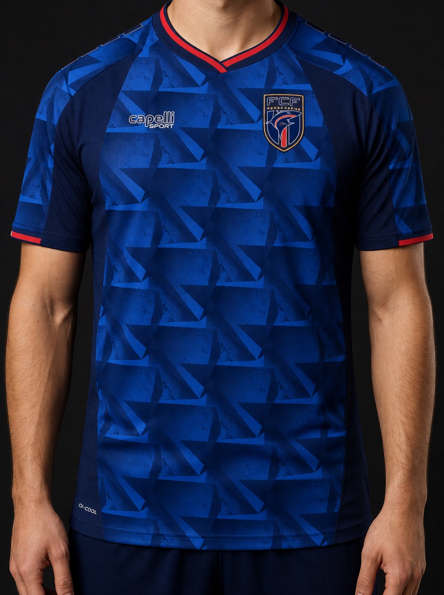
Cape Verde’s 2026 shirt offers one of the cleanest lessons in symbolism in World Cup jersey design because the pattern does not ask to be decoded like a riddle. Its triangular geometry traces the air routes linking the country’s 10 islands, turning a small patch of fabric into a diagram of connection for an archipelago of about 525,000 people; after Cape Verde’s 0-0 draw with Spain, that pattern read less like decoration and more like a public image of national unity.[1]
Haiti’s rejected Battle of Vertières design sits at the other edge of the same question. The original shirt placed historical battle imagery on the chest and was rejected by FIFA as “too political,” forcing a revised version that debuted against Scotland on 13 June 2026; months earlier, Haiti had also been required by the IOC to remove Toussaint Louverture imagery from Winter Olympics uniforms.[2] One design is allowed to make national memory legible as route, texture, or motif. Another is told that memory has become argument.
That tension is what makes the 2026 shirts useful as study objects rather than merchandise drops. With 48 nations and more than 96 kits, the tournament gives designers an unusually wide field for national storytelling.[3] The better question is not whether a jersey has a “hidden meaning.” It is what kind of sign the shirt uses, how visible the sign is, and whether the governing system treats it as culture, ornament, advocacy, or politics.
Cultural Heritage Works Best When It Becomes Structure
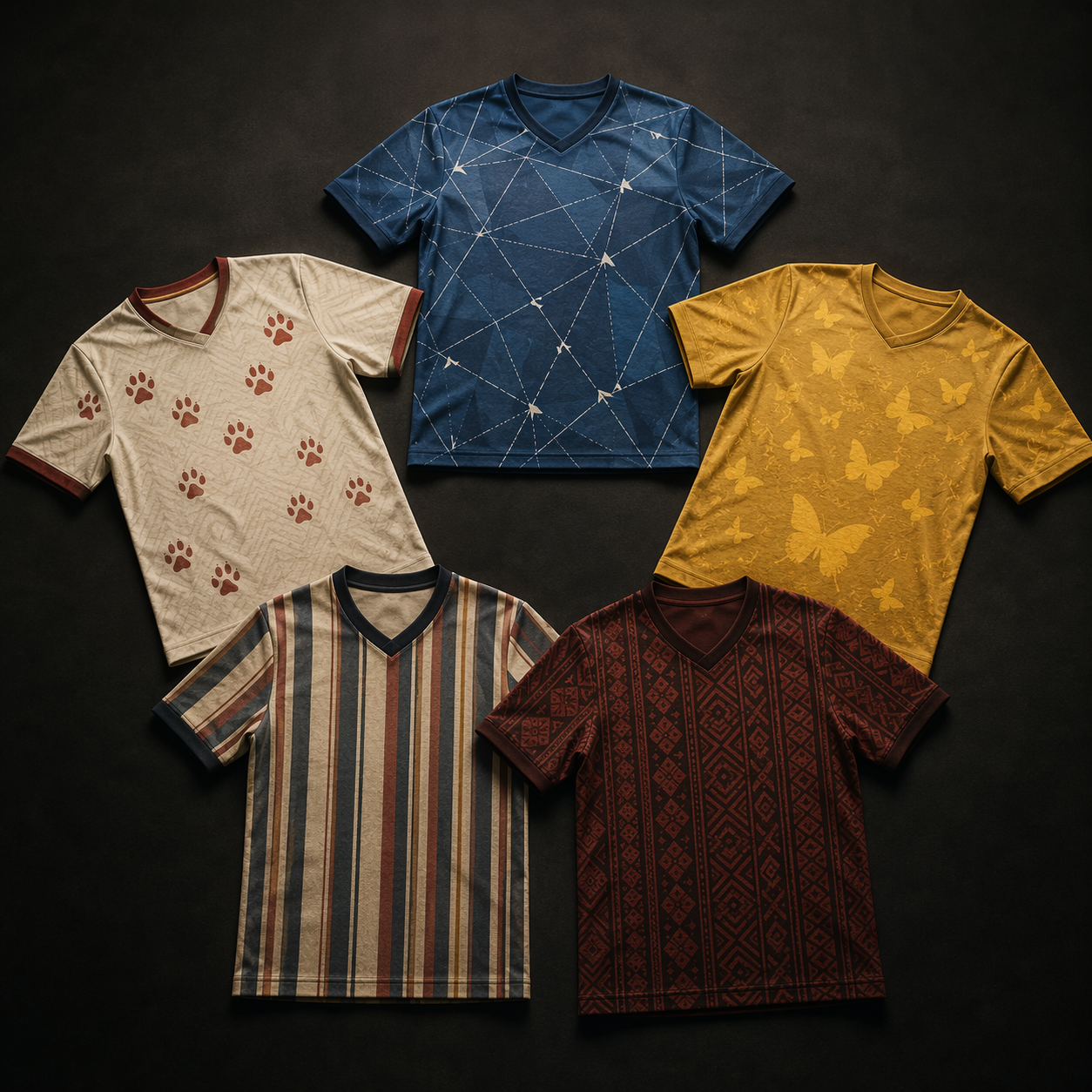
The most persuasive heritage kits in 2026 do not merely paste a national emblem onto a shirt. They make identity part of the shirt’s structure: a stripe count, a color layer, a woven texture, a route map. That matters because fabric has limited space. A crest can name a country; a pattern can show how that country imagines itself holding together.
Cape Verde is the clearest case because the shirt’s geometry does connective work. The triangular network is not an abstract “island vibe.” It refers to routes between specific inhabited places, so the visual language carries a social proposition: dispersed territory can still be read as one body.[1] On a World Cup stage, that is not a small claim for a smaller football nation to make.
Japan’s away shirt uses a quieter arithmetic. Its 12 stripes assign 11 to the players on the pitch and the red 12th stripe to supporters in the stands.[1] This is a familiar sporting idea, but the design choice makes the supporter visible without drawing a crowd scene or writing a slogan. The symbol works because it is countable. A student looking at the shirt can point to the formal move: number becomes community.
Argentina’s 2026 designs lean on memory through color and craft. The home kit blends three shades of blue associated with the country’s World Cup-winning uniforms from 1978, 1986, and 2022, while the away kit draws on filete porteño, the UNESCO-recognized Buenos Aires folk art technique known for ornamental linework.[3] The home shirt treats national history as a layered archive; the away shirt shifts from trophy memory to urban visual tradition.
Mexico’s Aztec calendar weave is more complicated. As a tonal jacquard, the motif appears as texture before it appears as statement, which helps explain why it passed regulation: it reads as decorative abstraction rather than a literal political or religious image.[2] That does not make it empty. It means the cultural reference has been translated into a surface language that broadcast cameras, kit rules, and commercial templates can all tolerate.
| Visible Feature | How It Carries Meaning |
|---|---|
| Cape Verde triangular pattern | Maps air routes between the 10 islands as a unity symbol |
| Japan’s 12 stripes | Counts 11 players and adds supporters as the red 12th stripe |
| Argentina’s layered blues | Connects the home shirt to World Cup-winning years |
| Mexico’s tonal jacquard | Turns Aztec calendar reference into approved decorative texture |
Literature And Art Are Easier To Carry When The Reference Is Precise
Literary and art references can become vague very quickly in sportswear. A shirt that says it is “inspired by imagination” usually asks the viewer to accept mood in place of evidence. Colombia and Belgium avoid that problem because their references are named, visible, and narrow.
Colombia’s butterfly pattern points directly to Gabriel García Márquez’s Nobel Prize-winning novel One Hundred Years of Solitude, where yellow butterflies recur as a motif.[4] The shirt does not need to summarize magical realism or convert a novel into a national slogan. It selects one image from the literary work and lets repetition do the job that quotation would have done clumsily.
Belgium’s collar is almost the opposite: small, verbal, and knowingly art-historical. Inside the collar, the phrase “Ceci n’est pas un maillot” echoes René Magritte’s “Ceci n’est pas une pipe” from The Treachery of Images.[4] It is a joke, but a precise one. The placement matters too. Hidden inside the collar, the tribute behaves like a marginal note rather than a billboard.
Nature Becomes Stronger When It Is Not Just Scenery
Nature imagery has long been safe territory for national kits: mountains, waves, feathers, animals, weather. The safer the category becomes, the more important the difference between scenery and advocacy becomes. Iran’s Asiatic cheetah motif belongs to the second group.
The design refers to an endangered animal whose population fell from about 400 in the 1990s to fewer than 70 remaining.[5] That number changes how the motif reads. A cheetah pattern can suggest speed in the most generic sporting sense, but here the animal is not merely a metaphor for athletic performance. It is a conservation signal carried into a space that usually prefers symbols to remain celebratory.
This is still a kit, not a wildlife policy. The shirt cannot prove effectiveness, and the available material supports a claim about advocacy intent rather than measurable conservation outcome. But as visual communication, the move is legible: a national team uses attention from a global tournament to put an endangered native species into circulation.
Architectural And Ornamental Tradition Has To Survive The Camera
Some symbols are not images in the usual sense. They are systems of line, carving, type, and ornament. Norway’s 2026 design makes that problem unusually visible because the story is not only about national style; it is about legibility under regulation.
Norway’s original Elder Futhark-inspired font was rejected by FIFA for insufficient broadcast legibility, after which Nike redesigned the type to comply while retaining a Viking aesthetic; Urnes-style patterns also flank the chest cross.[2] This is a genuine design constraint, not just bureaucratic interference. A shirt number has to be read quickly by referees, commentators, viewers, and data systems. If national character makes the number illegible, the symbol fails one of the garment’s practical jobs.
The compromise is instructive. Norway did not have to abandon the historical register entirely. It had to move from archaeological romance toward a typeface that could still perform at distance. For students, that is a useful reminder that cultural design is rarely a choice between authenticity and dilution. It is often a negotiation among reference, rule, medium, and use.
The Hardest Boundary Is Political Expression
The approved-versus-rejected cases reveal a pattern that is hard to ignore: symbols become safer when they can be read as texture, ornament, wildlife, literature, or heritage craft. They become riskier when they look like explicit historical argument.
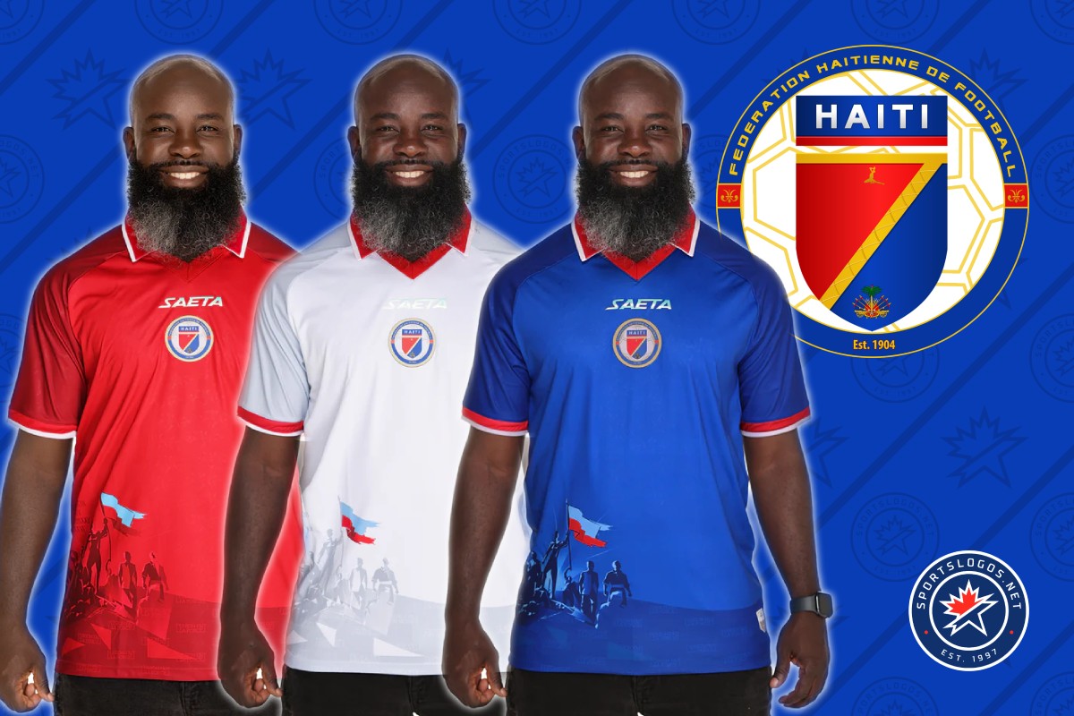
Mexico’s Aztec calendar weave and Haiti’s Battle of Vertières imagery show the boundary most clearly. Mexico’s reference survives because it is abstracted into tonal fabric. Haiti’s original design does not, because a battle scene with silhouetted figures raising a flag reads as a historical claim placed directly on the body.[2] Both are cultural. Only one is permitted to remain culture rather than politics.
That distinction is not stable enough to be treated as a universal rule. The available reporting describes a fuzzy and inconsistently applied line between pattern and picture, and FIFA has changed interpretations before, including around poppy symbolism.[2] What matters for reading 2026 kits is the practical effect: abstraction protects some kinds of memory, while figuration exposes others to review.
This does not require treating every governing decision as bad or every brand statement as cynical. Norway’s revised font shows why regulations can have a legitimate design purpose. But Haiti’s case shows that legibility is not the only issue. Sometimes the question is not whether viewers can read the symbol, but whether they are allowed to read it at all.
How To Read A 2026 Kit Without Turning It Into A Treasure Hunt
A useful reading starts with what is visible. Is the symbol a stripe, a collar inscription, a jacquard weave, an animal motif, a color layer, a typeface, or a chest illustration? The visible feature should come first because it keeps interpretation attached to evidence. A shirt does not become meaningful because a caption says so; it becomes meaningful when the visual choice can survive explanation.
- If the feature organizes the whole shirt, as with Cape Verde’s route geometry, read it as structure.
- If the feature counts, repeats, or layers, as with Japan’s stripes or Argentina’s blues, ask what community or history is being counted.
- If the feature quotes literature or art, as with Colombia and Belgium, check whether the reference is specific enough to verify.
- If the feature names nature, as with Iran’s cheetah, separate symbolic advocacy from proven real-world effect.
- If the feature depicts history directly, as with Haiti’s rejected design, notice who has the authority to reclassify culture as politics.
The 2026 World Cup kits show cultural heritage, literature, nature, architectural ornament, and political memory competing for space on the same small garment. The most revealing pattern is not that every shirt has a secret. It is that symbols become safest when they can pass as texture, and riskiest when they look like explicit historical argument.
References
- 11 World Cup jerseys with colorful backstories, AP News
- FIFA Jersey Regulations on Cultural Kits: Approved, Banned & Grey Areas, Tonton Sportswear
- World Cup 2026: Every Kit, Every Story, SSSports
- Eleven World Cup jerseys with hidden meanings you probably missed, The Independent
- 2026 World Cup Kit Hidden Meanings: The Stories Behind the Designs, Tonton Sportswear
Comments
Join the discussion with an anonymous comment.