
An Economics Study Guide to Inflation and Bond Yields
This guide explains how inflation drives bond yields, what the yield curve signals about future expectations, and how professional forecasters use bond market data — illustrated with current 2026 market conditions.
Updated:
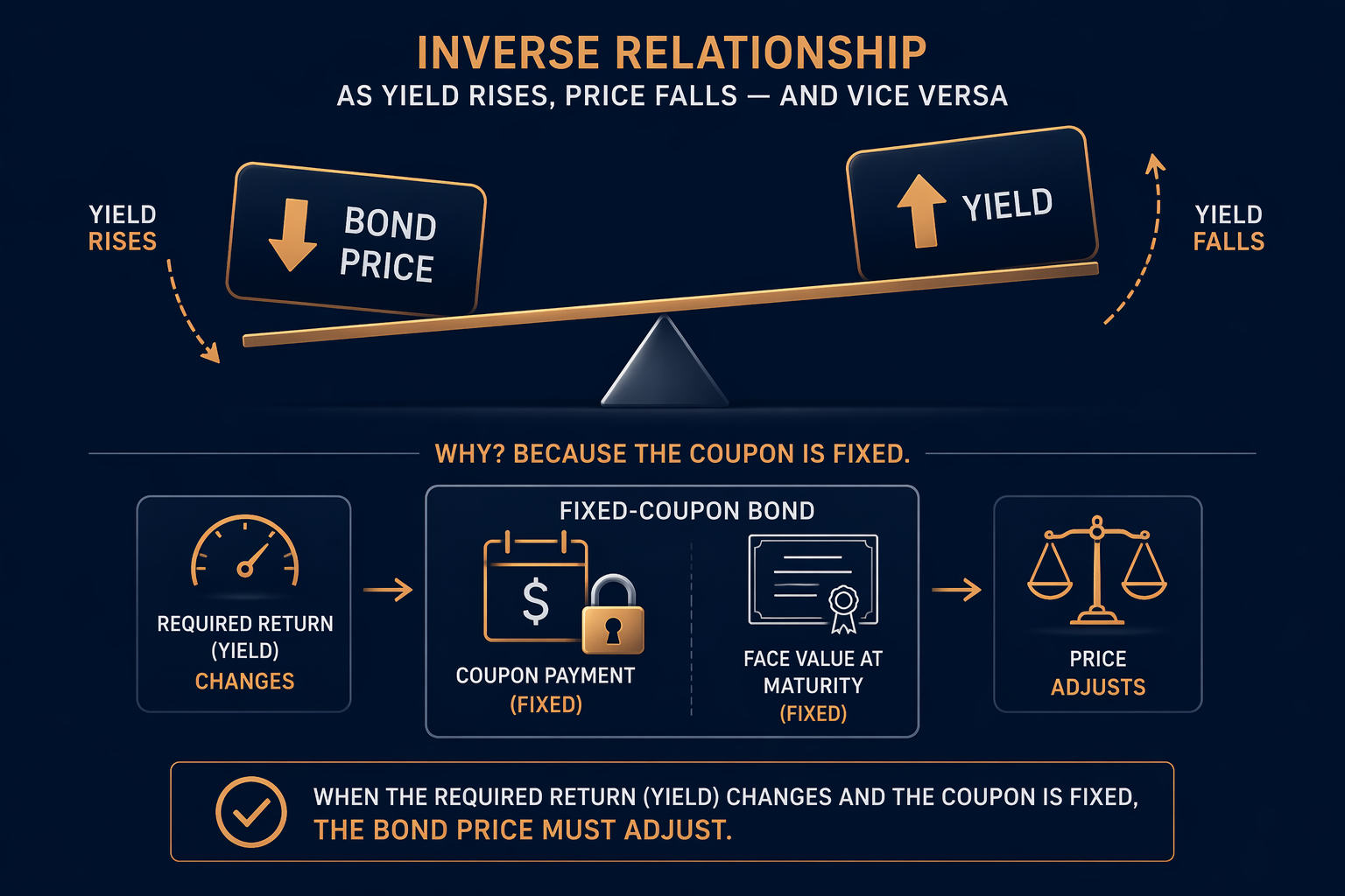
Think about a fixed-coupon bond first. Its coupon payments do not change, so when buyers suddenly require a higher yield, the bond's market price must fall until the promised cash flows offer that higher return. That inverse price-yield link is the mechanical starting point in the St. Louis Fed's student explainer, the RBA's bond primer, and standard market references [1][2][3].
That is why inflation matters before anyone starts talking about Fed forecasts. Inflation reduces the purchasing power of the fixed coupon, so the same dollar payment is worth less in real terms. To restore the expected real return, investors demand a higher nominal yield, and the lower price does the adjustment [4].
What the 2026 data is showing
The 2026 market is useful because the theory is visible but not tidy. In mid-2026:
- Core PCE in April was 3.3% year over year [5].
- CPI in May moved above 4% year over year for the first time in three years [6].
- The 10-year Treasury yield had been trading in a 4% to 4.5% range since March [5].
- The Fed funds rate was held at 3.5% to 3.75%, while fed funds futures shifted from pricing about three cuts in February to even the possibility of a hike by May [5].
- The term premium was still below its long-term average, but rising, which points to more inflation uncertainty rather than a single clean signal [5].
Those numbers do not point in one direction by themselves. They show several channels working at once: sticky inflation lowers the real value of fixed coupons, the expected policy path changes the required return, and extra uncertainty adds compensation at the long end of the curve. That is why a 10-year yield in the 4%-plus range can be consistent with more than one story at the same time.
Reading the yield curve
The RBA's framework is the cleanest way to read the curve. A normal, upward-sloping curve usually fits expectations of firmer future growth and inflation; an inverted curve points toward recession expectations and has preceded every US recession since the 1960s; a flat curve sits between the two. The 2026 curve is not a dramatic inversion story. It is positively sloped but compressed, which is better read as mixed expectations than as a clean verdict [2].
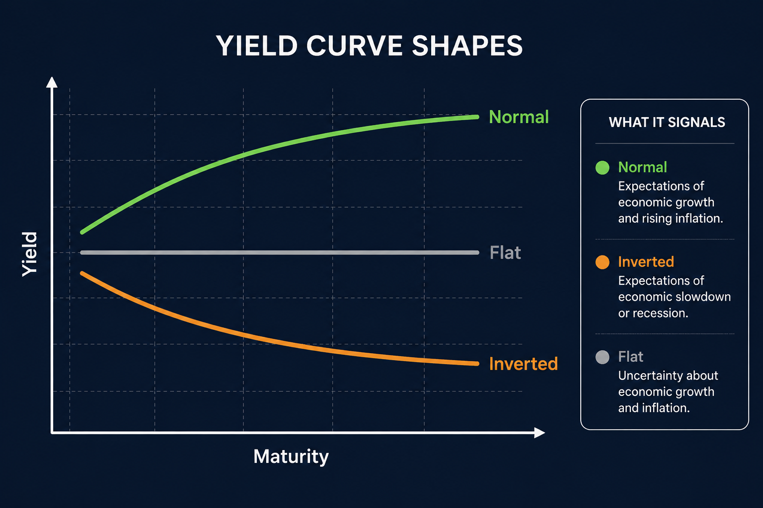
That matters because the curve is not just a shape on a chart. It is a forecast object. Investors are comparing today's inflation with what they think inflation, growth, and policy will look like across different maturities, so the curve bundles several expectations into one line.
Forecasters disagree, and that matters
Professional forecasters were not clustered around one answer at the end of 2025. The St. Louis Fed reported that the Blue Chip consensus in December 2025 expected 2026 CPI inflation of 2.9% and a 10-year Treasury yield of 4.1%, while the top-10 forecasters averaged 3.3% inflation and 4.4% yields [7]. The same review also found that forecasters have historically overpredicted 10-year yields by about 0.4 percentage points on average, with mean absolute forecast errors of about 0.7 percentage points for CPI inflation and 1.0 percentage point for GDP growth [7].
That disagreement changes how bond data should be interpreted. A June 2026 BIS working paper found that higher disagreement among forecasters dampens bond-yield reactions to data surprises, while higher monetary policy uncertainty amplifies them [8]. In an iShares/BlackRock outlook, Chair Kevin Warsh was described as having set up five task forces - Communications, Balance Sheet, Data Sources, Productivity and Jobs, and Inflation Framework - and the firm said that the disappearance of forward guidance makes the rate path harder to forecast; it also noted that 9 of 18 Fed members favored a rate hike in the dot plot [9].
That is the real lesson from the 2026 case. It is not useful because it hands students a neat one-line answer. It is useful because it shows the whole chain at once: inflation changes the real value of fixed coupons, investors reprice the yield they need, the curve records expectations about growth and policy, and forecasters disagree about how fast those forces will unwind. For an essay or exam answer, that is the level of explanation that holds up.
References
- Why Do Bond Prices and Interest Rates Move in Opposite Directions? - St. Louis Fed Page One Economics, Nov. 3, 2023
- Bonds and the Yield Curve - Reserve Bank of Australia
- Bond Market and Interest Rates - Investopedia
- Bonds 102: Inflation's Impact on Bond Performance - PIMCO
- Schwab 2026 Mid-Year Outlook - Schwab, June 2026
- Washington Update - BofA Private Bank
- Professional Forecasters' Past Performance and Outlook for 2026 - St. Louis Fed, Dec. 2025
- Working Paper No. 1361 - Bank for International Settlements, June 2026
- Fed Outlook, Rates, Kevin Warsh, Fixed Income 2026 - iShares/BlackRock, July 2026
Comments
Join the discussion with an anonymous comment.