
Stranger Things Cinematography Analysis for Film Students
This guide examines how Stranger Things' cinematography deliberately replicates and subverts the visual language of 1980s cinema, offering film students a practical framework for analyzing intentional camera, lighting, and color choices in their own work.
Updated:
Calling Stranger Things “80s-looking” is a useful first reaction and a weak final analysis. It recognizes the show’s surface, but it does not yet explain the image. For film students, a stronger Stranger Things comparison analysis asks a more technical question: when the show borrows from 1980s cinema, what exactly is being reproduced, adapted, or inverted in the lighting, camera, lens, grade, and composition?
That distinction matters because Stranger Things is not one continuous retro filter laid over every scene. Its image system changes by space, season, threat level, and technology. Hawkins can look plain, warm, and legible; the Upside Down can become low-key and contaminated; the lab can turn greenish and institutional; California can feel sunny without being truly safe; the Russian prison can sit in a bluish, sodium-lit unease. If a student stops at “nostalgia,” most of the work the image is doing disappears.
Start With The Lighting Rule
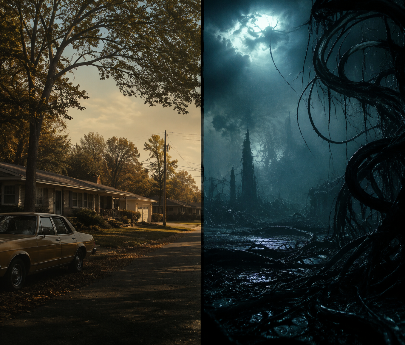
The cleanest analytical handle is the lighting contrast between ordinary Hawkins and the supernatural world. Cinematographer Tim Ives has described the show’s everyday Hawkins scenes as using flatter, more natural lighting, while Upside Down and supernatural sequences move toward low-key chiaroscuro, giving the series a visual shorthand for safety and threat before the dialogue has to explain either one.[1]
For shot analysis, that is more useful than saying the show “looks like Spielberg.” In a Hawkins domestic scene, a student can look for broad illumination, readable faces, lower contrast, warmer practical sources, and a world that still seems socially navigable. In an Upside Down or intrusion scene, the eye should move to contrast ratios, shadow density, motivated darkness, colored separation, and the way the frame withholds information.
The point is not that flat light always means safety or that low-key light always means danger. The point is that the show trains the viewer to read those conditions relationally. A room that was once legible can become threatening when the same space is re-lit, recolored, or invaded by a different contrast pattern. That is where cinematography becomes dramatic structure rather than decoration.
What To Annotate In A Frame
- Key direction: where the dominant light appears to come from, and whether it feels motivated by a practical source.
- Contrast: whether faces and backgrounds are evenly readable or divided into strong light and shadow.
- Color separation: whether warm and cool zones divide human space from supernatural or institutional space.
- Background visibility: whether the frame invites scanning or hides threat in darkness, haze, or negative space.
- Continuity of place: whether the same location changes meaning because the lighting system changes.
Those categories keep the analysis close to the image. They also prevent a common mistake: treating the Upside Down as merely a darker version of Hawkins. It is more precise to say that the show alters the lighting grammar of Hawkins so the viewer feels a familiar geography becoming unstable.
The Camera System Changes Across Seasons
The show’s camera history complicates the idea of a stable 1980s look. Stranger Things moved from RED Dragon in season 1, to RED Helium in season 2, to RED Monstro in season 3, and then to ARRI ALEXA LF in season 4. Caleb Heymann discussed the season 4 move to ARRI in relation to the broader color palette required by the season’s multiple locations, while Leitz Summilux-C primes were chosen for natural skin-tone rendering and a softer image.[2]
| Season | Camera Body | Useful Analytical Question |
|---|---|---|
| Season 1 | RED Dragon | How does the early image cultivate a controlled, referential version of 1980s genre memory? |
| Season 2 | RED Helium | What changes in sharpness, color handling, or texture as the world expands? |
| Season 3 | RED Monstro | How does a larger, brighter, more commercial setting affect the show’s retro surface? |
| Season 4 | ARRI ALEXA LF | How does the broader palette and large-format image change the relationship between homage and contemporary prestige television? |
This progression matters because a film student cannot responsibly describe the series as if all seasons use the same visual machine. Season 4 is especially productive for comparison because its technical shift moves the show away from simply simulating an older cinema texture. The image can still quote 1980s genre language, but it is doing so through tools that allow a wider color range, more location separation, and a kind of polish that 1980s theatrical images did not literally share.
That is not a flaw in the comparison. It is the comparison. Homage does not require technological reenactment. A show can borrow a compositional idea, a lighting convention, or a genre memory while using contemporary sensors and lenses to reorganize that memory for a different viewing environment. The mistake is to treat the resulting image as either “authentic” or “inauthentic” before asking what the image system is trying to accomplish.
Color Works Like Geography
The show’s color design is easiest to study as world-building. Hawkins is associated with warm browns and oranges that suggest small-town comfort; the Upside Down with desaturated cool blue-green decay; Hawkins Lab with greenish fluorescents and institutional sterility; California with warm, sunny false safety; and the Russian prison with bluish sodium-light twilight and permanent unease.[3]
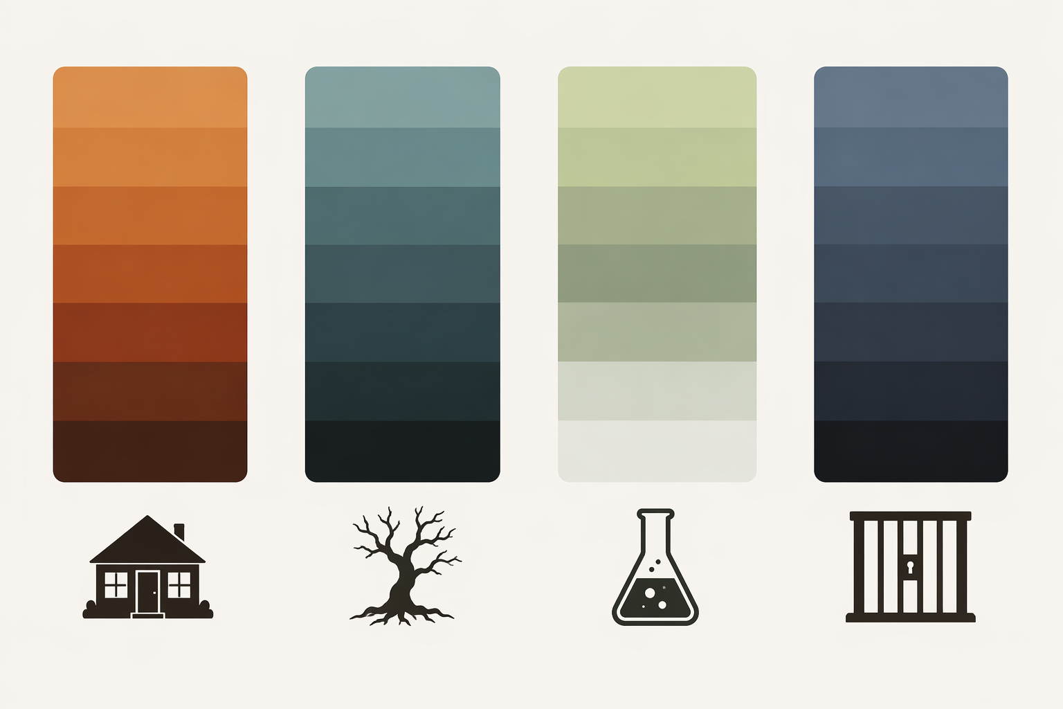
The word “palette” can become vague unless the student connects it to function. Warmth in Hawkins does not simply mean happiness; it gives the town a baseline from which dread can depart. The lab’s greenish fluorescents do not merely signal “science”; they flatten people into institutional space. California’s brightness can look liberating at first glance, but its warmth is not the same as protection. Season 4’s wider location spread makes those differences harder to ignore.
A useful exercise is to pause a scene before the plot announces where the danger is and ask what the grade has already told the viewer. Is the frame warm but crowded? Cool but clear? Green and sterile? Bright yet emotionally exposed? These are not mood adjectives floating above the scene. They are formal cues that assign place, genre, and expectation.
Borrowing Is Not One Thing
Once the lighting, camera, and color systems are in view, the famous reference points become easier to classify. Stranger Things contains deliberate visual quotations and echoes from E.T., Poltergeist, The Goonies, Stand By Me, and Alien, but these references do not all operate the same way. Vox’s useful formulation is that the show captures the feeling of watching 1980s movies, not merely the checklist of their images.[4]
For classroom analysis, three categories are enough. Direct quotation is when a shot or sequence is close enough in staging, composition, or movement that comparison becomes unavoidable. Atmospheric homage is looser: a scene borrows a genre environment, group dynamic, lighting mood, or adventure rhythm without demanding a one-to-one match. Structural inversion is more interesting than either, because the show sets up a recognizable source pattern and then changes the power relation inside it.
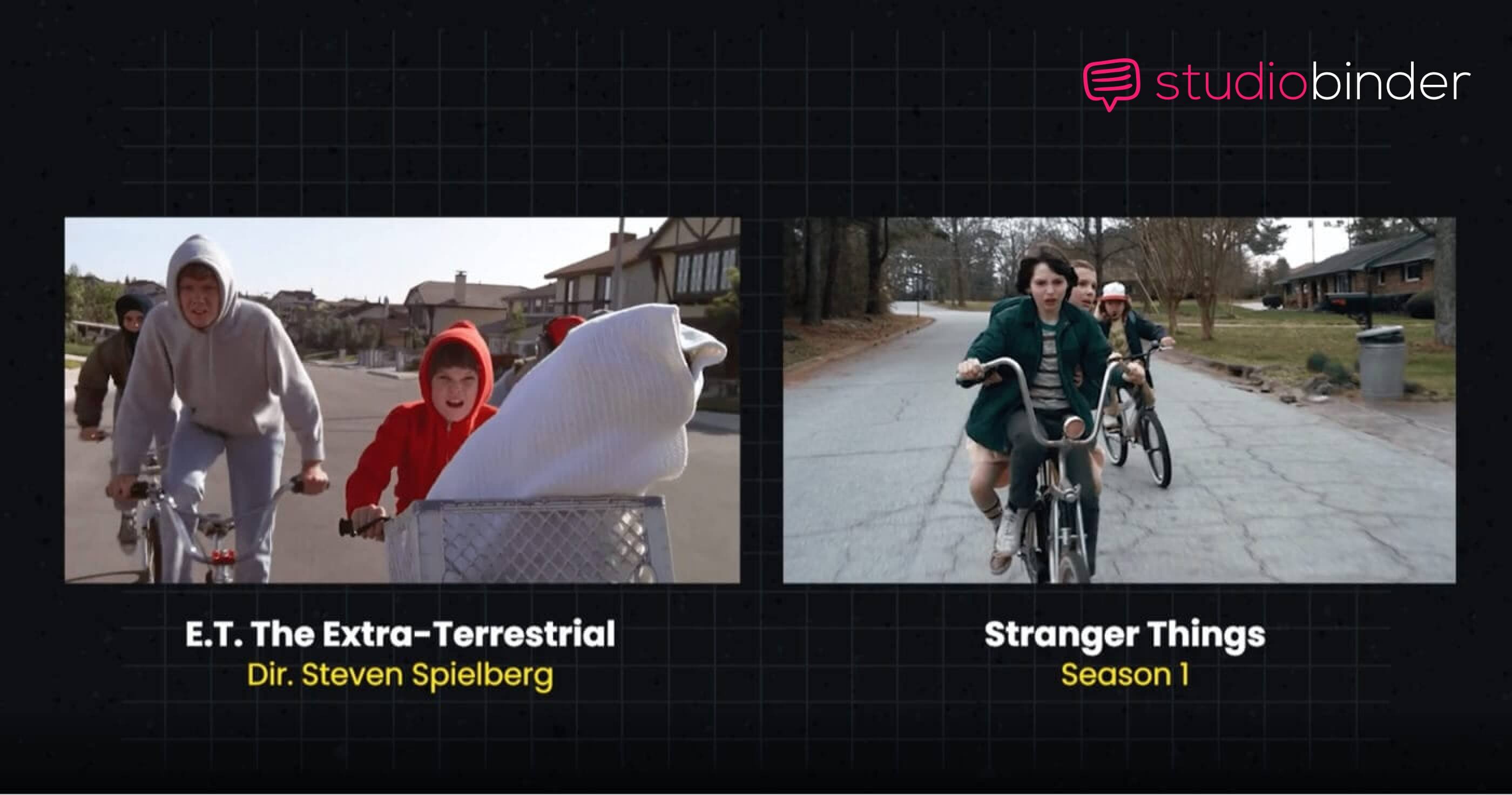
The season 1 bike chase is the obvious test case. The E.T. comparison is visible in the bicycles, night sky, child adventure framing, and sense of impossible escape. But the important difference is that Eleven does not lift the bikes in the same way E.T. does. The reference is not only a quotation of a beloved image; it changes who holds power in the scene. A student should therefore compare both the frame and the action logic: what is being borrowed, and who is newly allowed to act?
The Christmas lights sequence works differently. Its Poltergeist connection sits in the domestic space made uncanny: ordinary household illumination becomes a communication system and a supernatural threshold. The comparison is less about a single matching composition than about a shared method of turning the suburban home against itself. The house is not abandoned as a safe genre space; it is rewired.
The Goonies and Stand By Me echoes often appear through group movement, adolescent scale, and the adventure logic of children navigating spaces adults do not fully understand. Alien belongs more to creature suspense, contamination, and the dread of partially seen bodies. These comparisons are useful only when they return to craft. If the analysis cannot name a frame, light source, blocking pattern, color shift, or withholding strategy, it is still at the level of recognition.
A Practical Comparison Method
A good comparison paragraph does not need to prove that Stranger Things is full of references. That is already clear. It needs to move from recognition to mechanism. The student’s job is to identify the visual rule, compare it to the source tradition, and explain the effect of the change.
| Analytical Move | Question To Ask | Weak Version | Stronger Version |
|---|---|---|---|
| Identify | What visual feature creates the comparison? | This looks like E.T. | The low-angle bicycle composition and night-sky silhouette invite an E.T. comparison. |
| Differentiate | What has changed? | It is a reference but darker. | The sequence shifts the source’s rescue logic by making Eleven the active force. |
| Explain | What does the change do? | It makes the scene exciting. | It turns homage into character power, so the borrowed image advances the show’s own dramatic structure. |
| Contextualize | How does the scene fit the show’s wider system? | The show is nostalgic. | The warm Hawkins baseline and supernatural lighting contrast make the familiar suburb feel breakable. |
This method also helps with season-level analysis. Instead of saying season 4 “looks more expensive,” a student can connect the ARRI ALEXA LF move to broader location coding, expanded palette demands, and a changed relationship between 1980s reference and contemporary image quality. Instead of saying the Upside Down is “creepy,” the student can describe low-key contrast, desaturation, blue-green contamination, and the loss of everyday spatial comfort.
Use Rewatching As Evidence, Not Decoration
Scene-level claims need rewatching. The season 1 bike chase, the Christmas lights sequence, and the season 4 location palette shifts are especially worth revisiting because their effects depend on moving-image details: when the light changes, how long a shot withholds information, whether a composition is matched or merely reminiscent, and how a color environment behaves across a sequence rather than in a single still.
The show is worth studying because it makes intention visible. Its best lessons are not that references are fun, though they are, or that 1980s cinema can be revived, though the show clearly enjoys trying. The stronger lesson is methodological: comparison analysis becomes serious when it asks what changed in the light, camera, lens, grade, or composition, and what that change does to place, danger, memory, or genre.
References
- Stranger Things Cinematography Explained — Camera, Lighting & Lenses, StudioBinder.
- Uncovering The Process Behind Stranger Things' Cinematography, NoFilmSchool.
- Let's Talk About the Bleak Cinematography of Stranger Things, FormedFromLight.
- Stranger Things doesn't just reference '80s movies. It captures how it feels to watch them., Vox.
Comments
Join the discussion with an anonymous comment.