Cornell Notes for College: How to Adapt the Template for Any Subject
The standard Cornell layout works well for general lectures, but STEM, humanities, and language courses each need specific template modifications. This guide shows how to adjust column ratios and add subject-tailored sections so your notes fit the class, not the other way around.
Available Formats
Access links are provided in the guide below.
A standard Cornell notes template for college lectures can feel perfect for the first week of a broad survey course and completely wrong by Thursday afternoon in calculus. The cue column is too wide for a formula but too narrow for a worked problem. The notes column is big enough for sentences, not for a reaction mechanism, a Punnett square, or a professor’s diagram that keeps growing sideways. Then literature class has the opposite problem: the quote fits, but there is no obvious place to unpack why it matters.
That is usually the moment students decide they are “not Cornell notes people.” Sometimes that is true. Often, the page is simply asking the wrong thing from the class.
The useful part of Cornell is not the exact box geometry. It is the review loop: record the lecture, reduce the notes into cues, recite from those cues, reflect on the material, and review it again. Cornell University’s Learning Strategies Center describes the system around those five moves: Record, Reduce, Recite, Reflect, and Review, with notes on the right, cues on the left, and a summary at the bottom of the page.[1] If the template keeps you from doing those moves in a real class, change the template before you throw away the method.
Start with the baseline, then let the subject argue with it
The familiar Cornell page gives you a cue column on the left, a larger notes column on the right, and a bottom section for a summary. Many templates use something close to a 30/70 split between cue space and note space, with about two inches reserved at the bottom for the summary. That layout is fine for a lecture where the professor moves through terms, claims, dates, definitions, examples, and testable ideas in a mostly linear way.
The problem starts when the course asks the page to hold a different kind of thinking. York University’s guide is blunt about one limitation: Cornell is “not visual” and is “not ideal for subjects that require diagrams.”[2] That is not a small complaint. It is exactly why the same template that works in an intro lecture can collapse in organic chemistry, anatomy, statistics, art history, or linguistics.
So the first decision is not paper versus app. It is this: what does the class make you write down during the hardest five minutes of lecture?
| Course type | Better starting layout | What changes |
|---|---|---|
| General lecture | 33/67 cue-to-notes split | Keep the classic Cornell structure; use cues for terms, questions, and likely exam prompts. |
| Dense STEM lecture | 25/75 split with grid or dot-grid ruling | Shrink the cue column, widen the notes area, and make room for diagrams, formulas, and worked examples. |
| Discussion-heavy humanities | 40/60 split with quote-analysis space | Give the left side more room for questions, claims, passages, and discussion threads. |
| Language course | Cornell page with embedded tables | Add vocabulary grids, conjugation tables, example sentences, and pronunciation or grammar cues. |
Those ratios are practical starting points, not scientifically proven cutoffs. The point is to make the page serve the review habit. If the cue side cannot hold usable prompts, you will not quiz yourself later. If the notes side cannot hold the actual work of the class, you will stop using the page during lecture.
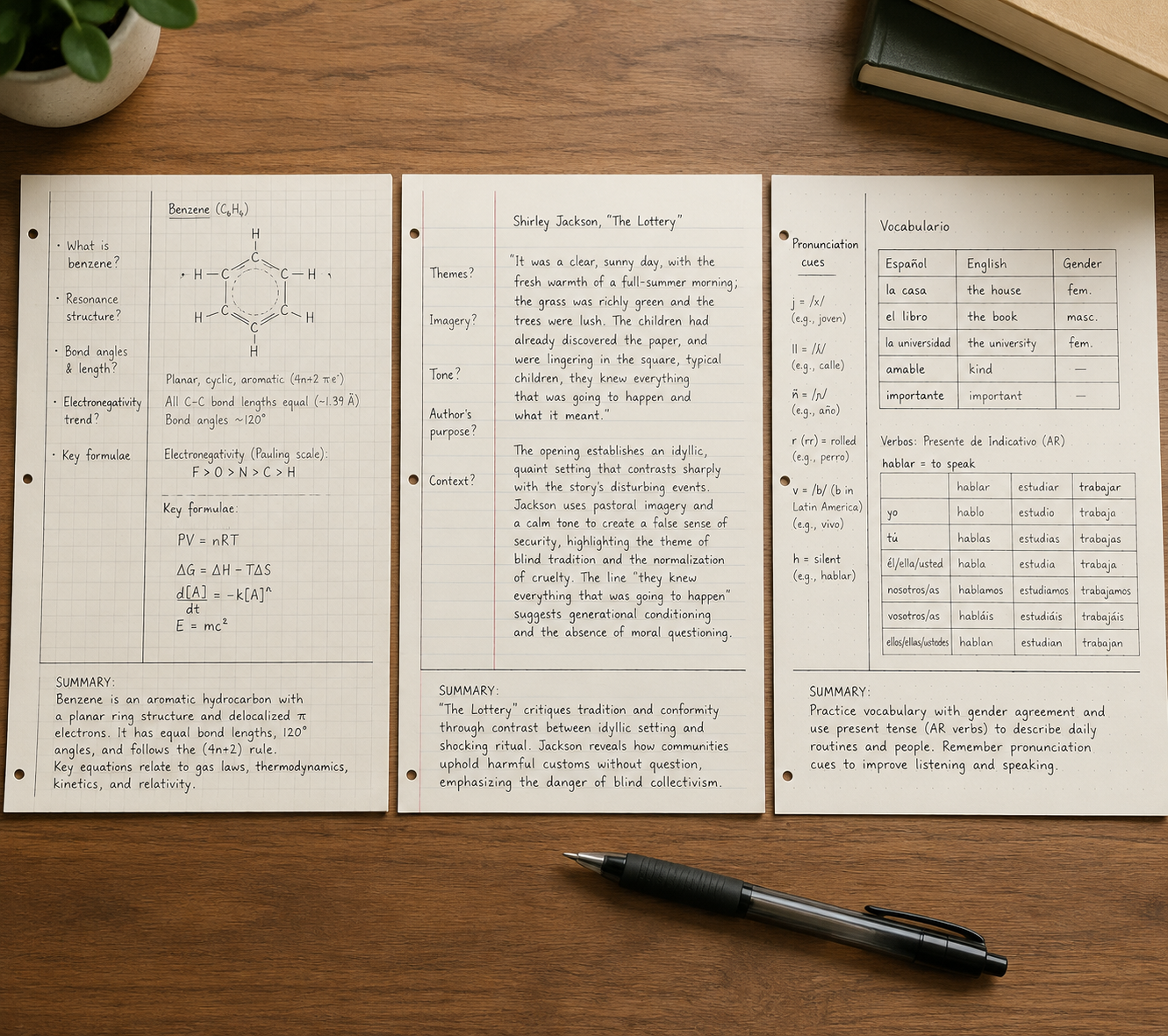
For STEM, make the notes area bigger than feels traditional
STEM is where the standard Cornell layout breaks most visibly. A narrow cue column works for “What is osmosis?” It does not work as the main place for a free-body diagram, a matrix setup, a circuit sketch, or a multi-step derivative. If you keep the standard layout, the notes column fills with cramped arrows and half-erased symbols while the cue column sits politely unused.
For calculus, chemistry, physics, biology, statistics, computer science, and engineering lectures, start with a 25/75 split. Give the main notes area the extra width. Use grid or dot-grid ruling instead of college-ruled lines when the class includes spatial work: graphs, mechanisms, tables, labeled diagrams, coordinate axes, or aligned equations.
The cue column still matters, but it should stop pretending to be a miniature notes column. In STEM, good cues often look like problem triggers:
- “When do I use this formula?”
- “What is the first setup step?”
- “What assumption makes this simplification legal?”
- “What mistake did the professor warn us about?”
- “Can I solve this without looking at the worked example?”
That last cue is the one students skip when the page is too cramped. They copy the example, box the answer, and feel finished. The review never actually asks them to reproduce the process.
A math adaptation that uses the cue column differently
EC Tutoring gives a useful math variation: put the problem itself in the cue column and work the steps in the larger notes area.[3] That sounds small until you try reviewing from it. When the problem sits on the left, you can cover the solution and test whether you know the next move. The cue column becomes the prompt, not an afterthought.
For a math-heavy page, I would set it up like this:
| Page area | What goes there | Review use |
|---|---|---|
| Left cue column | Original problem, theorem name, formula prompt, or common error | Cover the right side and attempt the setup or full solution. |
| Right notes area | Worked steps, diagrams, substitutions, units, professor comments | Check where your reasoning diverged from the model. |
| Bottom summary | One sentence about the method, not just the topic | Turn the example into a reusable rule. |
A weak summary says, “Today we learned integration by parts.” A useful summary says, “Use integration by parts when the integrand can be split so one part becomes simpler after differentiation.” It is not prettier. It is testable.
Where diagrams should live
Do not squeeze diagrams into the cue column just because it is empty at the beginning of lecture. Put diagrams in the main notes area where they can breathe. Then use the cue column to ask what the diagram is supposed to prove, label, compare, or explain.
For biology, the cue might be “What moves across the membrane?” while the notes area holds the membrane sketch. For physics, the cue might be “Which forces are acting before decomposition?” while the notes area holds the free-body diagram. For chemistry, the cue might be “What makes this carbon electrophilic?” while the notes area holds the mechanism. The cue is not the drawing. The cue is the question that makes you use the drawing later.
If your professor draws quickly, leave blank space without guilt. A half-complete diagram with room to fix it after class is more useful than a tiny complete diagram you cannot read two days later.
For humanities, widen the cue side when the class is really a conversation
Humanities courses fail on the standard Cornell page in a quieter way. The notes may look clean. The quote is copied accurately. The professor’s interpretation is written down. The discussion point is there somewhere. But when it is time to write a paper or prepare for an exam, the page does not show what you think, what the text says, and what the class argued about as separate things.
For literature, philosophy, history, political theory, religious studies, and discussion-heavy seminars, try a 40/60 split. The left side needs more room because the cues are not always short vocabulary prompts. They may be interpretive questions, passages, claims, counterclaims, dates, schools of thought, or tensions the professor keeps returning to.
The most useful humanities adaptation is a quotation-and-analysis structure. Instead of letting quotes float inside the notes column, give them a predictable place.
| Page area | Humanities use | What to avoid |
|---|---|---|
| Left cue column | Key question, passage locator, debate, theme, or exam-style prompt | Writing only a vague topic like “identity” or “war.” |
| Right notes area | Short quotation, paraphrase, professor’s claim, class objection, your analysis | Copying a quote without explaining what work it does. |
| Bottom summary | A claim you could defend in discussion or an essay | Summarizing the plot or lecture sequence only. |
A literature page might use the cue column for “How does the narrator control sympathy here?” The notes area can hold a short quoted phrase, then two or three lines explaining tone, contradiction, and class discussion. A history page might use the cue column for “Economic cause or political justification?” and the notes area for evidence, lecture framing, and a source limitation.
This is where a wider cue column earns its space. You are not only preparing to remember what was said. You are preparing to enter the argument again.
The bottom summary should become a thesis rehearsal
In humanities notes, the bottom summary is often wasted on “We discussed chapter three and symbolism.” That may be true, but it will not help much later. A stronger summary makes a small arguable claim: “The chapter uses domestic objects to show how control is disguised as care.” Even if that claim changes, it gives your future self something to test against the text.
For exam review, cover the notes area and answer the cue as if it were a short-answer prompt. For paper planning, scan the summaries first. The pages with the strongest bottom claims are usually the pages worth returning to.
For language classes, add tables instead of forcing vocabulary into lecture notes
Language courses need a Cornell template that can hold repetition without becoming a word pile. A plain notes column tends to mix vocabulary, grammar rules, example sentences, pronunciation notes, and instructor corrections in the order they appeared. That order rarely matches how you need to study.
Keep the Cornell frame, but put small tables inside it. The cue column can hold the English meaning, grammar prompt, pronunciation reminder, or verb tense. The notes area can hold the target-language form, example sentence, conjugation pattern, gender, register, or common mistake.
| Language task | Cue column | Notes area |
|---|---|---|
| Vocabulary | Meaning, category, or image prompt | Target word, article or gender, example sentence, collocation |
| Verb conjugation | Tense, subject, irregular pattern | Conjugation table and one original sentence |
| Pronunciation | Sound cue or stress pattern | Spelling, phonetic reminder, instructor correction |
| Grammar | When to use the structure | Rule, model sentence, exception, contrast with English |
The bottom summary should not say, “New vocabulary and preterite practice.” Make it do a little retrieval work: “I use the preterite for completed past actions, and these three verbs change stems.” If the class is conversation-heavy, end with one sentence you can actually say aloud next time.
The 24-hour fix: finish the Cornell part after lecture
Most Cornell pages are not finished when class ends. They are captured. The method starts working when you return to the page soon enough to add cues, clean up gaps, and write the summary while the lecture still makes sense. Cornell’s 5R process depends on that movement from recording to reducing, reciting, reflecting, and reviewing.[1]
A subject-adapted page makes that follow-up less annoying. In STEM, you can turn examples into problem prompts. In humanities, you can turn discussion notes into arguable questions. In language classes, you can turn a messy word list into a quiz table. The template is doing its job if it makes review easier to start.
Use this quick pass after class:
- Circle gaps you need to repair from slides, the textbook, or a classmate.
- Add cues that can become quiz prompts, not just labels.
- Cover the notes area and try to answer two or three cues out loud or in writing.
- Write a bottom summary that names the method, argument, pattern, or rule.
- Mark one page or problem to revisit before the next class.
If you want the research side of why reciting and retrieval matter, read the science of note-taking. If you mainly want to know whether Cornell is the right system at all, compare it with outline, mapping, charting, Zettelkasten, and PARA in this note-taking systems framework.
Paper, PDF, or app: choose the format after you choose the layout
Digital Cornell notes go wrong when the app becomes the project. A beautiful notebook cover, ten pen colors, and a synced dashboard do not matter if you cannot cover the notes area, quiz from the cue column, and write a summary without friction.
Once you know the layout your class needs, choose the medium that preserves it.
| Format | Best for | Watch for |
|---|---|---|
| Paper notebook or printed template | Students who remember better by handwriting and want low setup | You need separate templates for STEM grids, humanities pages, and language tables. |
| Custom PDF in a handwriting app | Students using tablets who want grid, dot-grid, or college-ruled Cornell pages | The PDF should match the subject layout, not just the classic template. |
| Notion, OneNote, or RemNote | Students who want searchable notes, typed review prompts, or linked study material | Make sure the cue-question-review habit does not disappear into decoration. |
GoodNotes describes Cornell note-taking in a digital handwriting context and supports custom paper styles such as grid, dot-grid, and ruled layouts, which is useful if you want a STEM or language template that still feels like a notebook page.[4] KenzNote’s app comparison lists GoodNotes at $9.99 one-time, along with free options such as Notion, OneNote, and RemNote; it also notes RemNote’s built-in Cornell-style documents.[5]
That pricing and feature list is helpful, but it should not decide the method for you. A free tool that lets you make cues quickly is better than a paid tool where review becomes a weekly formatting ritual. A PDF that prints cleanly may beat an app if your professor bans laptops or if your tablet battery is always at eight percent by lab.
A simple digital test before committing
Before moving a whole semester into a digital Cornell setup, test one lecture page. Can you add cues within a day? Can you hide or cover the notes area? Can you recite from the cue column without accidentally seeing the answer? Can you write a bottom summary that stays attached to the page? Can you find the page again before the next quiz?
If the answer is no, the app is not supporting Cornell yet. It is only storing notes in a Cornell-looking shape.
When the adapted template still does not fit
Some classes resist Cornell even after you modify the page. Studio courses, design critiques, highly visual anatomy review, coding projects, and research-heavy seminars may need mapping, charting, linked notes, flashcards, or project notes instead of a Cornell page for every class meeting.
That is not a failure. Cornell is a review structure, not a moral obligation. If your course depends on connections across many notes, a linked system like Obsidian for classes may fit better. If you want a structured school-friendly process with more explicit stages, AVID focused notes may be worth trying.
The important thing is to be honest about what broke. If you never used the cue column, the fix may be review habits. If the page could not hold the lecture, the fix may be layout. If the course is built around relationships, sources, or projects rather than lecture recall, the fix may be a different note-taking system.
A practical template choice for your next lecture
If you need a Cornell notes template for college lectures and do not want to redesign everything, start with the course type:
- Use the standard Cornell layout, or a 33/67 split, for general lecture courses where ideas arrive mostly in sequence.
- Use a 25/75 split with grid or dot-grid ruling for STEM courses that require diagrams, formulas, graphs, or worked examples.
- Use a 40/60 split for humanities seminars where questions, quotations, claims, and discussion threads need more cue space.
- Add vocabulary grids, conjugation tables, example sentences, and pronunciation cues for language courses.
- Keep the bottom summary in every version, but make it name the rule, method, argument, or pattern you need to remember.
Adapting the page will not guarantee better grades. The evidence around Cornell notes as a grade-raising intervention is mixed, and the subject-specific layouts here are practical adaptations rather than controlled-study conclusions. What a better template can do is remove a very real obstacle: the feeling that the method fails because your class refuses to fit inside the default boxes.
If the standard layout made Cornell feel unusable, change the page first. Shrink the cue column for equations. Widen it for discussion. Add tables for language study. Use paper, PDF, or an app if it preserves the review loop. Keep Record, Reduce, Recite, Reflect, and Review, or the template becomes just another organized-looking notebook page.
References
- Cornell Note Taking System — Cornell University Learning Strategies Center.
- Cornell — York University.
- Cornell Notes Increase Grades — EC Tutoring.
- Cornell Notes — GoodNotes Blog.
- Best Apps for Cornell Notes — KenzNote.
Related Guides & Templates
- How to Use a Study Schedule App Effectively: An Evidence-Based Method That Actually Improves Grades →
This guide teaches students who already have a study app how to use it effectively by grounding their planning in cognitive science. Learn the 3-step method of implementation intentions, time-blocking, and active recall scheduling to bridge the gap between planning and execution.
- Why Most Homework Trackers Fail for ADHD Students — and What Actually Works →
Traditional homework trackers often fail students with ADHD within weeks because they rely on the executive functions that ADHD impairs. This article explains the five specific failure points, why standard systems break down, and what an ADHD-friendly tracker actually needs to work.
- How to Build a Weekly Assignment Planning Routine That Actually Sticks (Free Template) →
Most students abandon their planners after 2–3 weeks. This article explains why — and provides a 3-step weekly routine based on habit-formation psychology, plus a free printable template designed to make the habit stick.
Comments
Join the discussion with an anonymous comment.