
Method
Evidence-Graded Aurora Borealis Forecast and Study Resources
A curated, evidence-graded guide to the most authoritative free resources for understanding aurora borealis forecasting and the science behind it, from NOAA tutorials and NASA primers to peer-reviewed accuracy data and citizen science databases.
Evidence panel
- Evidence level
- High
- Primary citation
- Kosar et al. 2018, Earth and Space Science
A useful list of aurora borealis forecast and science study resources should do two jobs at once. It should help a beginner decide whether tonight is worth watching, and it should teach that same beginner why the answer is never as clean as a weather icon on a phone. The northern lights are forecastable in parts, measurable in parts, and still stubborn enough to humble a confident map.
The safest way through the clutter is to sort resources by what they are actually good for. NASA is a good first stop for the physical explanation: charged particles, Earth’s magnetic field, atmospheric gases, and auroral colors. NOAA’s Space Weather Prediction Center is stronger for forecast literacy, especially because its Aurora Tutorial separates short-term, multi-day, 27-day, and solar-cycle timescales instead of blending them into one vague promise. The Geophysical Institute at the University of Alaska Fairbanks is useful as a practical forecast dashboard. Peer-reviewed work using Aurorasaurus reports then supplies the necessary cold water: a forecast view line can be helpful and still miss the sky from the ground.
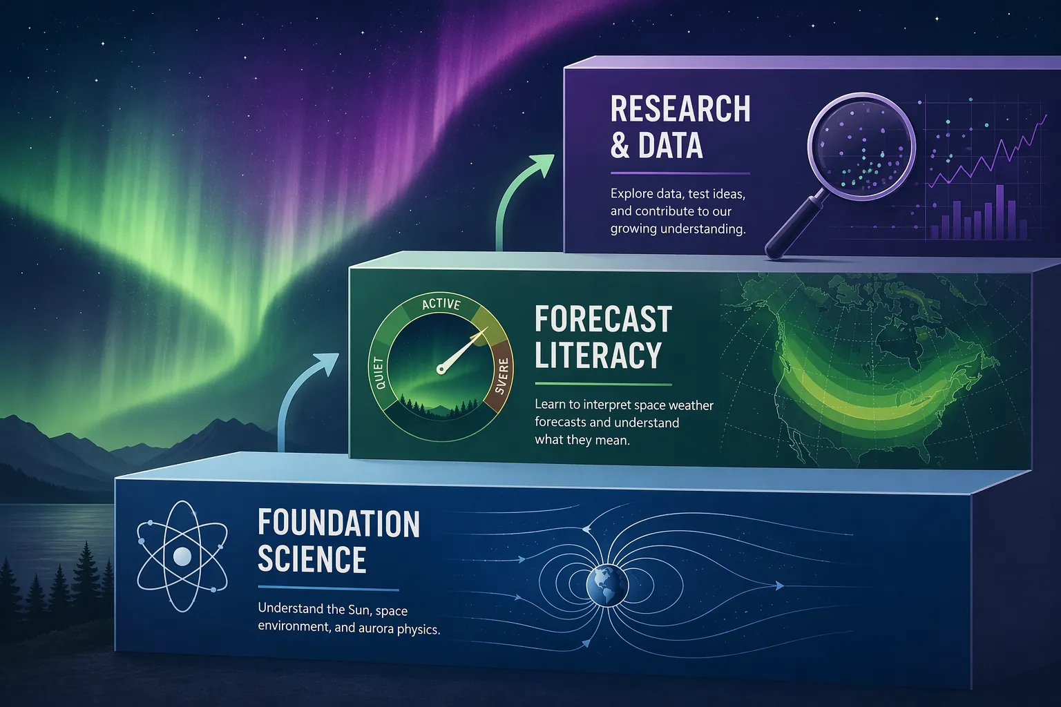
| Tier | Best starting resource | Use it for | Evidence grade |
|---|---|---|---|
| Foundation science | NASA Auroras | How auroras form, why colors differ, and how the magnetosphere shapes the display [1] | Authoritative public science primer |
| Forecast literacy | NOAA SWPC Aurora Tutorial | How forecast time horizons differ: 15-45 minutes, hours-to-days, 27 days, and the 11-year solar cycle [2] | Primary agency tutorial |
| Forecast dashboard | Geophysical Institute Aurora Forecast | 3-day, 27-day, historical Kp, and OVATION-style short-term forecast views [3] | Operational educational tool |
| Accuracy check | Kosar et al. 2018 / Aurorasaurus | Ground-report validation of the SWPC view line using 9,519 citizen-science reports [4] | Peer-reviewed analysis with open citizen data |
| Research methods | NSF MANGO article and Canadian Space Agency material | How all-sky imagers, magnetometers, and northern research networks study auroral events [8][9] | Institutional research explanation |
Start With the Science, but Do Not Stay There Too Long
NASA’s aurora page is the right first layer because it gives the learner enough physics to stop treating the lights as decorative weather. Auroras happen when charged particles from the Sun interact with Earth’s magnetic environment and upper atmosphere; different atmospheric gases and altitudes help produce different colors, with oxygen and nitrogen central to the visible display [1]. That is the basic footing a forecast user needs before opening a map.
The point is not to memorize every particle pathway before looking outside. It is to know what the forecast is trying to represent. A green band on a map is not a tourist attraction marker. It is a modeled expression of space-weather conditions that may or may not line up with darkness, clouds, local horizon, human eyesight, camera sensitivity, and where the auroral oval actually brightens during the observing window.
That distinction matters for students. If the lesson stops at “solar particles hit the atmosphere,” the aurora remains a pretty effect. If the lesson moves one step further, the learner begins asking better questions: What was measured? What was modeled? What was predicted? What was reported by observers on the ground? Those questions are where forecast literacy begins.
The Forecast Tool Is Only Useful After You Know Its Time Horizon
The NOAA Aurora Tutorial is the most important free resource in this set because it refuses to treat “the forecast” as one thing. It describes several forecast windows: very short-term aurora estimates on the order of 15 to 45 minutes, hours-to-days forecasts, 27-day recurrence patterns tied to solar rotation, and the broader 11-year solar cycle [2]. Those windows answer different questions. Mixing them is how beginners end up disappointed.
| Forecast window | Question it can help answer | What it cannot honestly promise |
|---|---|---|
| 15-45 minutes | Is the auroral oval modeled near my region right now? | Whether clouds, local darkness, or a weak display will allow a visible view |
| Hours to days | Is geomagnetic activity likely enough to plan an evening watch? | A guaranteed display at a specific overlook or town |
| 27-day recurrence | Could a solar feature rotate back into a similar Earth-facing position? | A repeat of the same aurora show from the previous rotation |
| 11-year solar cycle | Is the Sun in a more active part of its long rhythm? | That any particular night in a peak period will produce visible aurora |
The shortest window is the one most beginners expect to behave like a nowcast. NOAA’s OVATION product is commonly encountered as a 30-minute aurora forecast map, and the Geophysical Institute also presents an OVATION model view for short-term prediction [3]. This is the tool to check when someone is already in position or close enough to make a small adjustment. It is not the tool for deciding in July where to book lodging for a winter trip.
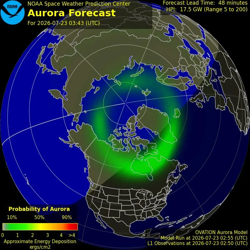
The hours-to-days window is better for planning behavior. It can tell a class, family, or local astronomy club whether to keep the evening flexible, charge camera batteries, choose a darker northern horizon, or set an alarm after moonset. It still cannot remove ordinary observing limits. A forecast can be encouraging while a low cloud deck does all the deciding.
The 27-day pattern is often misunderstood because it feels satisfyingly calendar-shaped. NOAA’s tutorial includes it because the Sun rotates, and some solar features can return to an Earth-facing position after roughly one solar rotation [2]. That makes it a pattern to watch, not a schedule to obey. A student can use it to form a cautious hypothesis: if activity came from a persistent solar source, a later recurrence may deserve attention. The hypothesis still needs current solar-wind and geomagnetic data before it becomes a viewing plan.
The 11-year solar cycle is the widest lens, and it is the one most vulnerable to headline inflation. It helps explain why interest is high in 2026: several public outlooks describe 2026-2027 as favorable aurora years in the Solar Cycle 25 peak or declining-phase context [5][6][7]. That is useful background for learning, travel flexibility, and classroom timing. It is not a guarantee that a visitor will see curtains of green light on a chosen night.
A Kp Number Is a Clue, Not a Boarding Pass
Kp is valuable because it compresses global geomagnetic activity into a number that ordinary users can track. It is also blunt. A Kp forecast can suggest that auroras may be visible farther from the poles than usual, but it does not know whether a particular student is standing behind trees, under haze, beside city lights, or at a latitude where a faint camera glow will be visible while the naked eye sees only gray.
That is why the Geophysical Institute forecast is best used as a dashboard rather than a verdict. Its pages combine practical forecast products such as 3-day, 27-day, historical Kp, and short-term model views [3]. A beginner can compare these views and ask whether the signals agree. If the short-term oval is close, the multi-day outlook is elevated, the sky is clear, and the observer is at a dark northern horizon, the case for watching improves. If only one element looks promising, the forecast has not failed; the evidence is simply thinner.
The Accuracy Gap Is Part of the Lesson
The cleanest correction to forecast overconfidence comes from Kosar et al. 2018, a peer-reviewed study that compared the NOAA SWPC aurora view line with Aurorasaurus citizen-science reports. In that dataset, the SWPC view line was validated at about 50.3% accuracy against 9,519 raw observations from roughly 5,000 community members during 2015-2016 [4].
That number should not be waved around as proof that aurora forecasts are useless. It is more interesting than that. It says that a widely used forecast boundary, tested against ground reports from actual observers, had measurable limits in a specific dataset and time period. It also says citizen reports are not just charming anecdotes from excited people in backyards. When collected systematically, they become a way to test what a model implied against what human observers actually saw.

The limitation travels with the number. The 50.3% result belongs to the Kosar et al. analysis and its 2015-2016 report set, and the paper notes that report volume scales with geomagnetic activity [4]. It should not be silently upgraded into a universal law about every aurora model in every solar-cycle phase. For a learner, the better takeaway is methodological: ask what forecast was tested, against which observations, from which years, and with what reporting bias.
This is also where aurora study becomes a good training ground for evidence judgment. A forecast map looks authoritative because it is visual, current, and official. A citizen report looks messy because it comes from a person standing somewhere with local weather and imperfect perception. The research value appears when enough reports are structured, geolocated, time-stamped, and compared with model output. The mess does not disappear; it becomes analyzable.
How to Use These Resources on a Real Observing Night
A practical observing routine does not need many tabs. It needs the right tab at the right moment. The mistake is opening a solar-cycle article, a Kp chart, a social media post, and a live oval map as if they all speak with the same authority about the next hour.
- Before the season: read NASA’s aurora explanation so the display has a physical cause, not just a color label [1].
- Several days out: use NOAA and the Geophysical Institute to judge whether geomagnetic activity is worth monitoring, not whether a display is guaranteed [2][3].
- The same evening: check short-term oval products, cloud cover, darkness, moonlight, and whether a northern horizon is available.
- During the watch: compare what the model suggests with what the sky, camera, and nearby reports show.
- Afterward: if the observation is usable, submit or compare reports through a citizen-science platform such as Aurorasaurus, keeping time and location as accurate as possible [4].
For a classroom, the same routine can become a compact methods exercise. Students can record the forecast window they used, the predicted oval position, Kp context, local sky condition, and whether an aurora was seen by eye, camera, both, or neither. Even a cloudy night can produce a useful result if the class distinguishes a failed observation from a failed forecast.
Why 2026 Is a Good Learning Moment, Not a Guarantee
The 2026 timing is genuinely useful. Public aurora outlooks from Space.com, BBC Travel, Aurora Expeditions, and the Geophysical Institute all frame 2026-2027 as strong aurora years in relation to Solar Cycle 25’s peak or declining phase [5][6][7][3]. For a teacher or self-directed learner, that means more public interest, more forecast checking, more possible reports, and more chances to connect solar activity with visible effects on Earth.
It does not mean the sky has become bookable. Solar-cycle context is a climate-like background for aurora opportunity, not a nightly forecast. A weak night near solar maximum can be quiet from the ground. A strong storm can still be hidden by clouds. This is not a reason to dampen enthusiasm; it is a reason to aim enthusiasm at evidence that updates as the observing window approaches.
When Forecast Watching Turns Into Research Literacy
Once a learner understands forecast windows and accuracy limits, the next step is not a harder travel guide. It is research method. The National Science Foundation’s article on the MANGO network is useful here because it shifts attention from consumer forecasts to instruments: all-sky imagers, ground-based magnetometer chains, and coordinated measurements during geomagnetic storms [8].
The same NSF piece reports striking measurements from the May 2024 geomagnetic storm, including near-supersonic winds of 600 meters per second and record temperatures of 2,200 K, or about 3,500°F [8]. Those figures are worth pausing over, but only in their proper frame. They describe a particular storm event and measurement context, not ordinary aurora-viewing conditions. Used carefully, they show why aurora science is not just about whether people saw green light. The upper atmosphere was moving and heating in ways that required instruments to capture.
The Canadian Space Agency’s material adds a northern research perspective, especially for learners interested in how auroras are studied from Canada through ground-based observation and space-weather monitoring [9]. It pairs well with the NSF article because both sources move the learner away from passive map checking. They show that aurora research depends on networks: cameras, magnetometers, satellites, local observers, data archives, and people willing to compare one line of evidence with another.
A Sensible Evidence Ladder
For study purposes, not every aurora source deserves the same job. Agency primers are good for stable concepts. Operational forecast centers are good for current conditions and forecast windows. Peer-reviewed papers are good for methods, validation, and limits. Citizen-science databases are good for ground reports when the data collection is structured. Tourism articles and viral posts may point to public interest, but they should not be allowed to carry the scientific argument.
| If the learner asks | Send them first to | Then ask them to check |
|---|---|---|
| What causes the aurora? | NASA Auroras | Can they explain why color depends on atmospheric interaction rather than magic or weather alone? |
| Will I see it tonight? | NOAA short-term products and Geophysical Institute forecasts | Do they know which forecast window they are using? |
| How reliable is the view line? | Kosar et al. 2018 | Do they distinguish the 2015-2016 dataset from a universal accuracy claim? |
| How do scientists measure storms? | NSF MANGO and Canadian Space Agency resources | Can they name the instrument or data stream behind the conclusion? |
| How can public observers contribute? | Aurorasaurus-linked citizen-science work | Is the report time, location, and visibility description good enough to compare with a model? |
That ladder keeps the beginner from two common traps. One trap is treating a beautiful forecast map as if it were a contract with the sky. The other is assuming that serious aurora study begins only when the math becomes forbidding. There is a middle route: learn the physical system, read the forecast by time horizon, compare prediction with ground truth, and then follow the instruments into the research literature.
References
- Auroras, NASA Science.
- Aurora Tutorial, NOAA Space Weather Prediction Center.
- Aurora Forecast, Geophysical Institute, University of Alaska Fairbanks.
- Aurorasaurus: A Citizen Science Platform for Viewing and Reporting the Aurora, Earth and Space Science, 2018.
- Northern lights 2026: Where and when to see the aurora borealis, Space.com.
- An aurora chaser's guide to the northern lights, BBC Travel, January 2026.
- Northern Lights Predictions, Aurora Expeditions.
- How to catch an aurora, National Science Foundation.
- Studying the aurora in Canada, Canadian Space Agency.
Applies to
Exam applicability isn't specified for this technique yet. See all exam hubs.
Comments
Join the discussion with an anonymous comment.