
SAT Exam Hub
How to Track a Tropical Storm for Geography Students
Geography students can learn to track a tropical storm using free NHC data, coordinate plotting, and the Saffir-Simpson scale in this hands-on lesson. The exercise builds data interpretation and pattern-recognition skills directly applicable to standardized science exams.
- SAT
- ACT
- GRE
- MCAT
- ASVAB
- digital-sat
- adaptive-testing
- registration-fee
- content-outline
- score-target
A tropical storm tracking lesson for geography students begins with a simple job: take a table of storm positions and wind speeds, turn those rows into points on a map, then explain what the finished track shows. The student is not guessing where the storm went. Each mark on the chart has to answer to one row of data.
For this lesson, use four materials: an official blank Atlantic tracking chart from the National Hurricane Center, a Hurricane Irene 2011 position-and-wind table, the Saffir-Simpson Hurricane Wind Scale, and a pencil. A spreadsheet can help with speed or ACE calculations later, but it should not replace the first skill: reading a coordinate and placing it accurately on a grid. The NHC provides free blank tracking charts for the Atlantic, Eastern Pacific, and Central Pacific basins, with PDF and image versions available without a login or subscription.[1]

Hurricane Irene is a good practice storm because the data set is complete enough for a full classroom exercise: 6-hourly positions, wind speeds ranging from tropical-storm strength through hurricane strength, and a lifecycle students can see as the track bends northward and then northeastward. The SERC InTeGrate Unit 3 materials use Irene 2011 with 6-hourly positions and wind speeds from 40 to 105 kt, plus an ACE extension showing Irene contributed about 20 of the 2011 Atlantic season's 121 total ACE, or roughly 16.5%.[2]
The timing matters too. The Atlantic hurricane season runs from June 1 to November 30, and on July 23, 2026, the season is active. A live storm can be used as an extension, but it is a fragile default: the available data changes, the storm may affect real communities while students are watching, and the best-track archive for the full 2026 season will not be complete until early 2027. The NHC HURDAT2 archive was updated in February 2026 through the 2025 season, so a historical storm such as Irene gives students a stable data set.[3]
Set Up the Track Before Plotting
Before the first point goes on the map, students should identify three things on the blank chart: the latitude lines, the longitude lines, and the basin. Irene belongs on an Atlantic basin chart, not on a global map or a Pacific chart. That sounds obvious, but exam passages often punish the student who reads the table correctly and then uses the wrong frame.
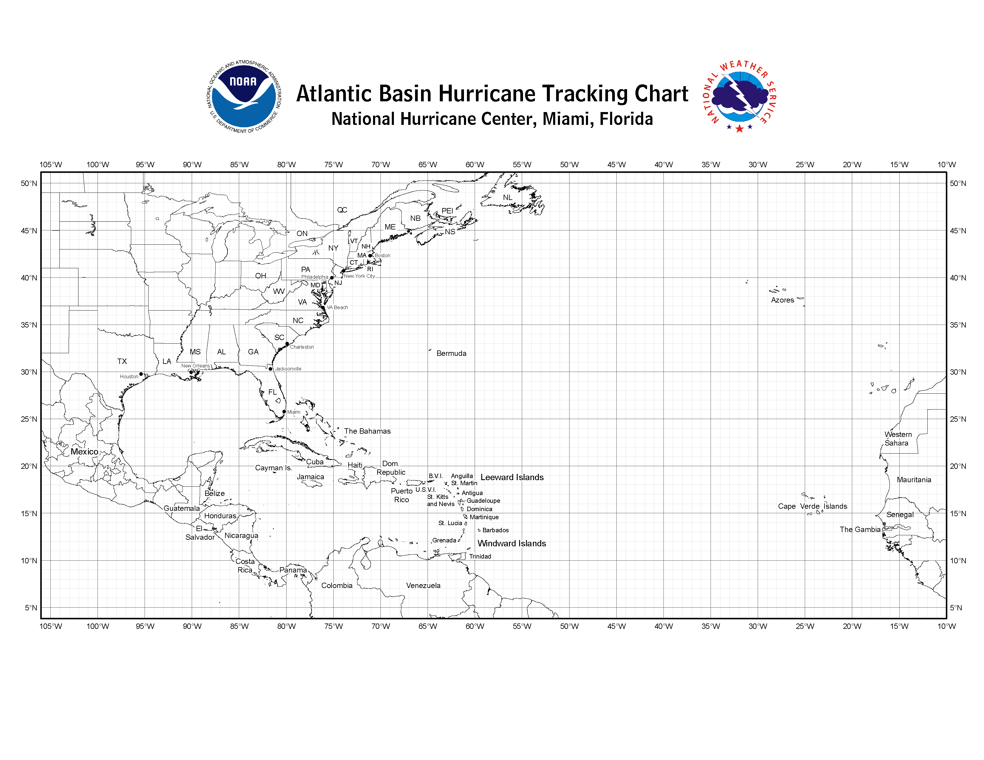
The student should also make a small key before plotting. Use one symbol for tropical-storm points, another for hurricane points, and a third mark for the maximum wind point. If the class is not yet ready for multiple symbols, keep the points identical and write the wind speed beside selected positions. The purpose is not to decorate the track. The purpose is to make the map carry both location and intensity.
| Student action | What the student must read | What the map should show |
|---|---|---|
| Plot each 6-hourly position | Latitude, longitude, date, and time | A sequence of accountable points |
| Connect points in order | Time order, not nearest-neighbor order | Storm movement through the basin |
| Mark wind-speed class | Maximum sustained wind in kt | Periods of strengthening and weakening |
| Compare point spacing | Distance moved over equal 6-hour intervals | Changes in forward speed |
| Write the interpretation | Track shape, category changes, and timing | A short evidence-based storm narrative |
Plot Each Coordinate as a Claim
A storm-position row usually gives latitude, longitude, date, time, and maximum sustained wind. The plotting routine should be slow at first. Read the latitude, find the horizontal line or estimated position between two lines, then read the longitude and move along that latitude to the correct meridian. In the Atlantic chart, most Irene longitudes are west longitudes, so the student should be watching the numbers westward across the basin rather than treating longitude as a plain left-to-right number line.
After placing the first point, label it lightly with the date or sequence number. Then plot the next 6-hourly point from the next row. Students should connect points only after several have been placed correctly. If a line suddenly jumps across the basin or cuts backward through the track, the problem is usually not the storm. It is often a copied longitude, a reversed sign, or a point plotted out of time order.
That error-checking habit is part of the lesson. A plotted point is a visible claim: this row of data belongs here. When students learn to ask whether the next point makes sense relative to the previous one, they are doing the same kind of consistency check they need in a data-heavy science passage.
A Practical Plotting Routine
- Read the row completely before marking the chart: date, time, latitude, longitude, and wind speed.
- Place the latitude first, then move to the correct longitude.
- Mark the point lightly and label it with a sequence number or date.
- Check that the new point is plausible compared with the previous 6-hour point.
- Connect points in time order only after the local sequence is correct.
For Irene, the finished track should not look like a random scatter of points. It should show a system moving through the tropical Atlantic and Caribbean region, then curving generally northward near the Bahamas and along the eastern side of the United States before continuing into higher latitudes. The exact shape comes from the points, not from a memory of hurricane news.
Classify Wind Speed Without Overclaiming
Once the track is plotted, students can classify wind speed. The Saffir-Simpson Hurricane Wind Scale is based on a hurricane's maximum sustained wind speed. It does not measure storm surge, rainfall, tornadoes, flooding, storm size, or total damage risk.[4] That caveat is not a footnote for specialists. It is the difference between a careful exam answer and an answer that turns one variable into a whole disaster forecast.
| Classification | Wind-speed criterion |
|---|---|
| Tropical storm | 39-73 mph |
| Category 1 hurricane | 74-95 mph |
| Category 2 hurricane | 96-110 mph |
| Category 3 hurricane | 111-129 mph |
| Category 4 hurricane | 130-156 mph |
| Category 5 hurricane | 157 mph or higher |
Many storm data tables, including the Irene teaching data, list wind in knots. Students therefore have to notice the unit before using a scale printed in miles per hour. A quick classroom rule is to keep the original unit visible and convert only when needed. The Saffir-Simpson page gives the scale in miles per hour, kilometers per hour, and knots, so a student can classify Irene directly in kt without inventing a conversion step.[4]
For Irene, students should mark the row or rows where the storm strengthens, reaches its maximum listed wind, and weakens. The InTeGrate Irene table's wind speeds span 40 to 105 kt, so the data set includes both tropical-storm and hurricane stages and reaches a Category 3 wind-speed range when using the NHC scale in knots.[2][4]
A good student sentence at this point is modest: "Irene strengthened from tropical-storm strength to hurricane strength, reached its highest listed wind of 105 kt, and later weakened as the track moved northward." That sentence uses the table and scale. It does not claim that the highest-wind point was automatically the point of greatest flooding, damage, or human impact.
Use Equal Time Intervals to See Forward Speed
The Irene data are especially useful because the positions are spaced at 6-hour intervals. Equal time intervals make the map easier to read: when points are close together, the storm's forward motion is slower; when points spread farther apart, the storm is covering more distance in the same amount of time. The student does not need a perfect distance calculation to see the first pattern.
A more advanced student can estimate forward speed between two positions. Choose two consecutive 6-hour points, estimate the distance between them using the chart scale or a mapping tool, then divide by 6 hours. The answer is not the wind speed. It is the storm's movement across the Earth's surface. Keeping those two speeds separate prevents a common confusion: a storm can have intense winds while moving slowly, or weaker winds while moving quickly.
NOAA's Atlantic Oceanographic and Meteorological Laboratory notes that average tropical cyclone forward speed varies by latitude band, with values around 9.4 kt at 20-25°N and around 21 kt at 35-40°N.[5] Irene gives students a way to test that broad pattern visually. As the plotted track moves into higher latitudes, the spacing between equal-time points can be compared with the earlier, lower-latitude portion of the track.
This is where the map begins to do more than locate a storm. It lets students compare position, time, and motion at once. A table alone can hide that relationship because the eye has to jump across rows. A map makes the repeated 6-hour interval visible.
Turn the Finished Track Into an Interpretation
After plotting and classification, students should write a short interpretation paragraph. This is the step many students skip because the map feels like the final product. For exam preparation, the paragraph matters as much as the plotted line. It forces the student to separate observation from explanation.
| Observation from the track | Careful interpretation |
|---|---|
| The points curve from a more westward track toward a northward and northeastward track. | The storm's direction changed during its lifecycle. |
| Wind speeds increase, reach a maximum, and then decrease. | The storm strengthened and later weakened according to maximum sustained wind. |
| Some 6-hour point spacings are wider than others. | The storm's forward motion changed; wider spacing means more distance covered in the same time. |
| The Saffir-Simpson category changes with wind speed. | The category describes wind intensity, not total hazard. |
A strong interpretation paragraph might read like this: "The plotted track of Hurricane Irene shows a storm that moved through the Atlantic basin, strengthened from tropical-storm strength into hurricane strength, and later weakened after reaching a maximum listed wind of 105 kt. The spacing between 6-hour points changes along the track, showing that Irene's forward motion was not constant. The Saffir-Simpson classification describes Irene's wind intensity at each stage, but it does not by itself measure rainfall, storm surge, or total damage."
That paragraph is not long, but it does the work. It uses location, time, wind speed, and scale limits. It also avoids two weak habits: describing the storm only as a line on a map, or describing the category as if it were a complete danger rating.
Add ACE Only After the Track Makes Sense
ACE, or accumulated cyclone energy, is useful as an extension because it rewards students who already understand time intervals and wind speed. The Irene teaching materials report that Irene contributed about 20 of the 2011 Atlantic season's 121 total ACE, roughly 16.5%.[2] That number does not mean Irene caused 16.5% of the season's damage. It is an energy-related measure based on wind and duration, so students should treat it as another way to summarize storm activity, not as a human-impact score.
For students who need a manageable extension, ask them to compare the ACE idea with the plotted track: a storm that stays strong for more 6-hour periods contributes differently from a storm that briefly reaches a high category and then weakens quickly. The key reasoning move is duration plus intensity, not category name alone.
Why This Helps With Science Exam Passages
A storm-tracking lesson belongs in geography, but the skill transfer is broader. Science passages on standardized exams often place students in front of unfamiliar graphics, units, and scales. The student who has tracked Irene has already practiced a compact version of that problem: read the axis, respect the unit, connect the table to the graphic, and explain the trend without adding claims the data do not support.
For SAT-style science reasoning, the useful habits are concrete. Latitude and longitude practice strengthens coordinate reading. The 6-hourly table builds comfort with time-series data. The wind-speed classifications require students to compare a value with a threshold. The Saffir-Simpson caveat trains them to ask what a scale actually measures before choosing an answer.
For MCAT atmospheric science review, the same exercise supports a different level of discussion. Students can connect storm movement with atmospheric circulation, distinguish wind intensity from forward motion, and practice reading a meteorological data set without turning one variable into a whole system explanation. The lesson does not teach all of tropical meteorology, and it should not pretend to. Its strength is narrower and more dependable: it makes spatial and quantitative evidence visible on the same page.
- Coordinate reading: plot latitude and longitude accurately rather than treating the map as decoration.
- Unit interpretation: notice whether wind speed is given in kt, mph, or km/h before classifying it.
- Trend recognition: identify strengthening, weakening, direction change, and changing point spacing.
- Scale limits: state what the Saffir-Simpson scale measures and what it leaves out.
- Evidence discipline: make every claim traceable to the table, chart, or classification scale.
A Finished Student Response
By the end of the lesson, the student should have a completed Atlantic tracking chart with Irene's 6-hourly positions plotted in order, wind-speed classes marked along the track, and the maximum wind point identified. The written response should be short enough to check, but specific enough that another reader can see the evidence behind it.
A usable final response could be: "Hurricane Irene's track shows movement through the Atlantic basin followed by a northward and northeastward curve. The 6-hourly positions show that forward motion changed during the storm's lifecycle because the spacing between points is not constant. The wind data show strengthening from tropical-storm strength to hurricane strength, a maximum listed wind of 105 kt, and later weakening. Using the Saffir-Simpson scale, the classification describes maximum sustained wind only, so the track and category should not be used by themselves to judge rainfall, storm surge, or total impact."
That is the usable result of the lesson: a plotted storm track plus a defensible interpretation. Tropical storm tracking works well for geography students because it joins map reading, quantitative interpretation, and pattern recognition in one exercise where the evidence stays visible.
References
- Blank Tracking Charts, National Hurricane Center.
- SERC InTeGrate Unit 3, SERC.
- HURDAT2 Atlantic Hurricane Database, National Hurricane Center.
- Saffir-Simpson Hurricane Wind Scale, National Hurricane Center.
- Frequently Asked Questions: Hurricane Movement, NOAA Atlantic Oceanographic and Meteorological Laboratory.
Related exhibits & inventory
Verified outcomes
No verified outcomes on file for this exam yet
See Methodology for how outcome evidence is disclosed once logged.
Planners
No planner filed for this exam yet
A downloadable timeline template for this exam hasn't been published yet.
Tool verdicts
AI-tool cautions
No AI tools tested for this exam yet
No hands-on AI-accuracy logs have been filed for this exam.
Questions about this plan
Ask a question about a specific section, timeline, or citation in this plan — or flag something that needs correcting.
Comments
Join the discussion with an anonymous comment.