
GRE,MCAT Exam Hub
How to Read NISAR L-Band Radar Images of Antarctic Ice for GRE/MCAT
Learn to interpret NISAR's hummingbird radar image of Antarctic ice and apply the same color logic to GRE and MCAT science passage questions that require extracting physical properties from color-coded visualizations under timed conditions.
- gre
- mcat
- asvab
- sat
- act
- digital-adaptive
- official-material
- section-strategy
- test-date-timeline
At first glance, the NISAR L-band radar Antarctica ice visualization looks like the kind of NASA image that can steal time from a nervous test-taker: a hummingbird shape in East Antarctica, with magenta and green spreading around a dark mountain peak. For GRE and MCAT purposes, the useful move is to stop admiring the bird and ask what the colors are doing as evidence.
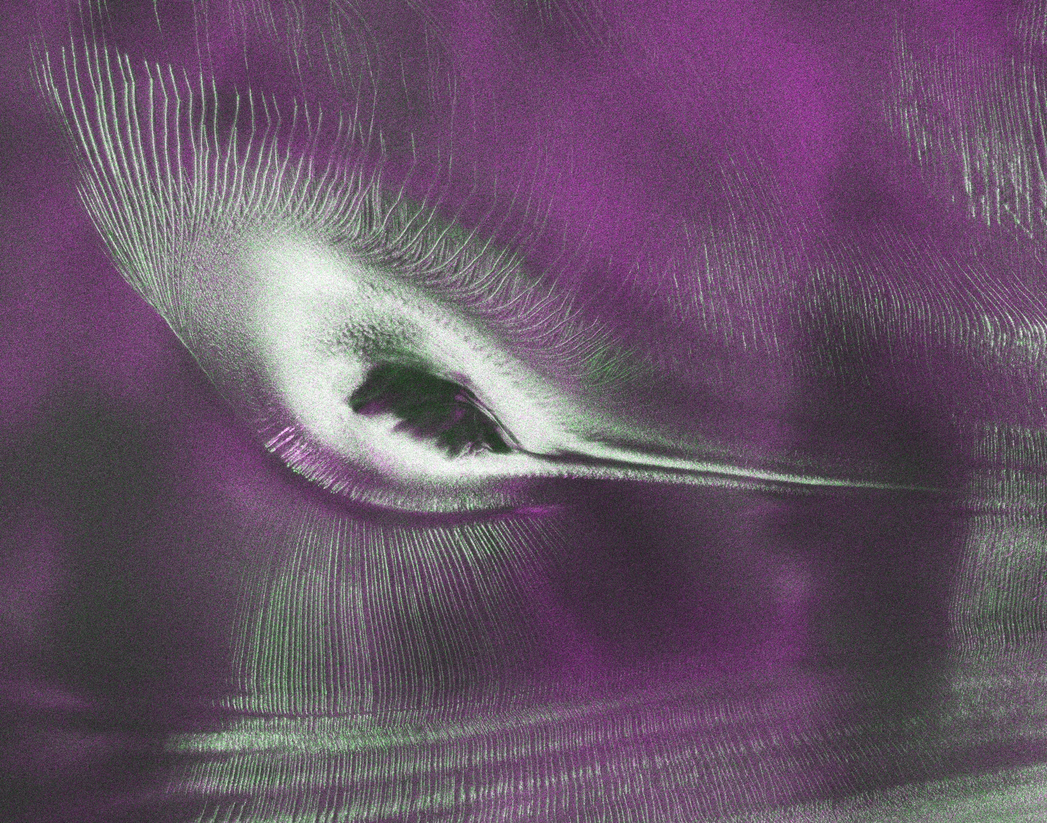
NASA describes the image as a NISAR radar view of Nunatak Zaterjavshijsja, a mountain peak surrounded by Antarctic ice. The image was produced during NISAR's commissioning phase in August 2025, and NASA/JPL highlighted it in July 2026 because the radar returns make the surrounding ice pattern look like a hummingbird [1][2].
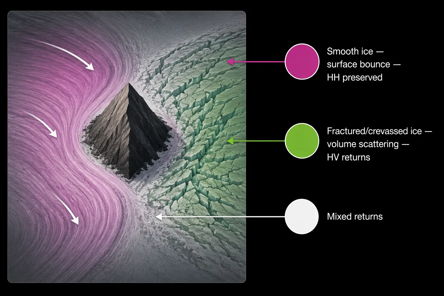
The exam skill starts with Seongsu Jeong's explanation of the color coding. In this image, magenta corresponds to smoother ice that produces a surface bounce and preserves HH polarization; green corresponds to crevassed or fractured ice that causes volume scattering and produces HV returns; white marks areas with mixed returns [1][2]. That is the decoding key. Without it, the image is attractive. With it, the image becomes a compact data figure.
Read the Color as a Physical Property
A color-coded science figure is rarely asking you to name a color. It is asking you to use the color as a label for something less directly visible: temperature, concentration, velocity, density, charge, stiffness, scattering behavior, or, here, ice structure. The first translation is therefore not magenta to "more" and green to "less." It is magenta to one kind of radar interaction and green to another.
| Color in the NISAR image | Radar behavior | Physical claim you can safely make |
|---|---|---|
| Magenta | Surface bounce with HH polarization preserved | The ice surface is relatively smooth in this radar interpretation [1][2]. |
| Green | Volume scattering with HV returns | The ice is fractured, crevassed, or structurally disrupted enough to scatter the radar signal [1][2]. |
| White | Mixed radar returns | The area combines return types rather than showing a single clean scattering behavior [1][2]. |
That table matters because it separates the visible mark from the measured behavior and then from the claim. On a timed exam, that middle column is where many wrong answers are built. A tempting answer may say that green ice is simply "brighter," "thicker," or "more reflective." The given evidence is narrower: green represents a radar return associated with fractured or crevassed ice, not a general statement that the ice contains more of every possible property.
The HH and HV labels are not decorative initials. In this context, HH means the radar signal is transmitted horizontally and received horizontally; HV means it is transmitted horizontally and received vertically. Smooth ice can return a signal in a way that preserves the horizontal polarization. Fractured ice can scatter the signal inside the ice and change the polarization of the returned signal, producing the HV channel emphasized in the green areas [1][2].
For a GRE or MCAT passage, you do not need to become a radar engineer. You do need to notice that the color is tied to a measurement process. Once a passage tells you that magenta is HH-dominant and green is HV-dominant, the question can test whether you keep that mapping straight while evaluating a claim about smooth versus fractured ice.
Why L-Band Matters Here
The NISAR detail worth keeping is not the whole satellite story. The useful fact is that NISAR's L-band radar has a wavelength of about 24 centimeters, which can penetrate snow and reveal subsurface crevasses that optical imagery may miss [1][2]. That single fact explains why this visualization can show structure rather than just surface brightness.
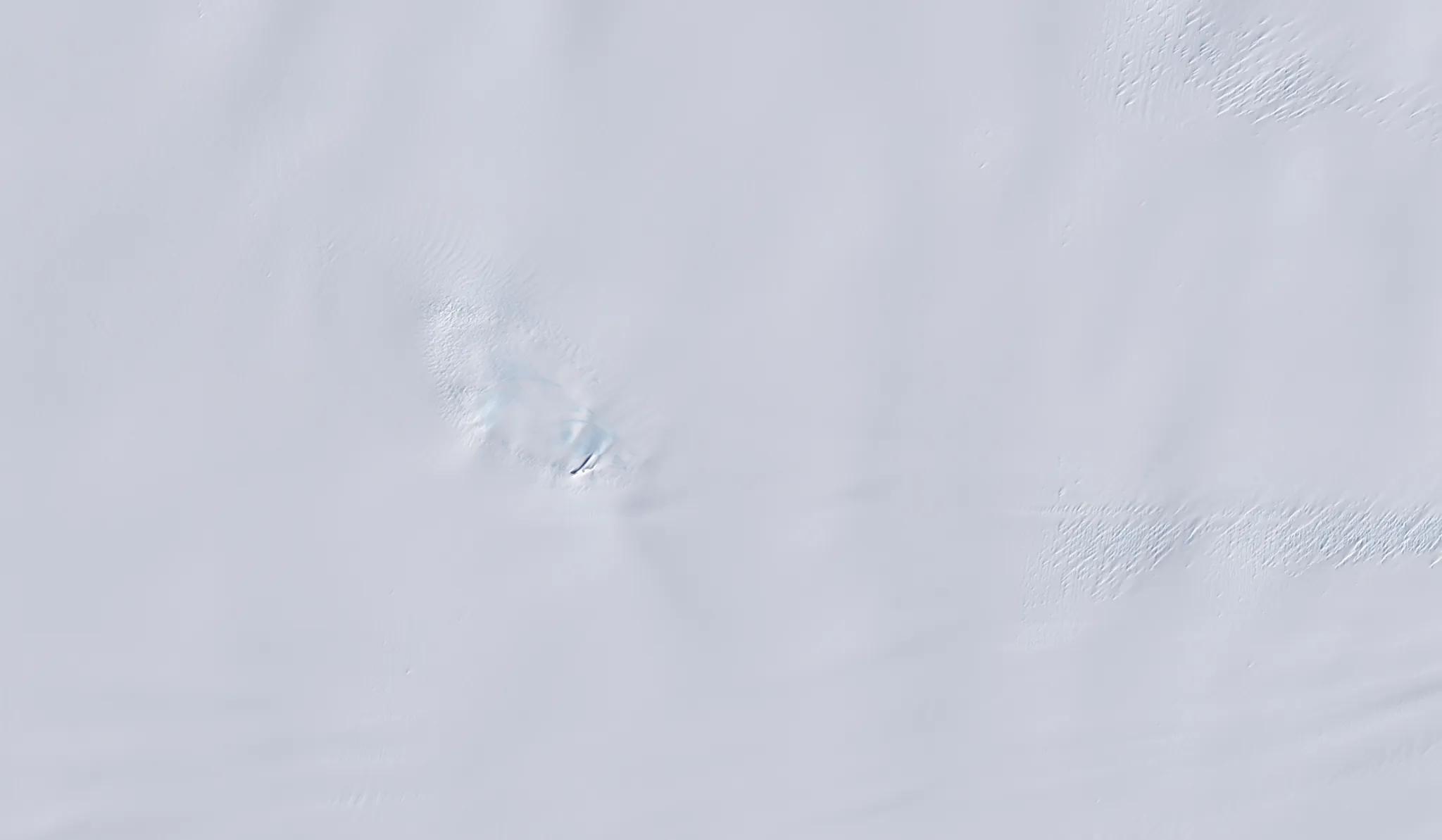
The contrast with optical imagery is the cleanest way to see the point. An optical satellite image of the same area mainly records surface albedo, so the snow and ice can appear as a bright, nearly featureless field. The radar image is not just a prettier version of that view. It is responding to a different physical interaction, which is why the radar view can distinguish smoother ice from fractured or crevassed ice where the optical image does not show the same structure [1][2].
This is exactly the kind of distinction test writers like because it rewards careful reading rather than outside expertise. If a passage states that Method A detects surface brightness and Method B detects subsurface scattering behavior, then a correct answer cannot treat the two images as interchangeable. A claim supported by the radar image may not be supported by the optical image.
The Timed-Test Sequence
A strange figure becomes manageable when you make the same three moves every time: find the mapping, translate the visible feature into the measured property, and answer only the claim the mapping supports. That sequence sounds plain, but it prevents a large share of figure-reading errors.
- Locate the stated key: in the NISAR image, color is tied to radar polarization and scattering behavior.
- Translate color into physics: magenta means smoother ice with surface bounce; green means fractured or crevassed ice with volume scattering; white means mixed returns.
- Convert physics into a restrained claim: green areas support a claim about fractures or crevasses, not a broad claim about age, thickness, temperature, or motion unless the passage gives more evidence.
- Check whether the question asks about the radar image, the optical image, or the difference between them.
That last step matters because exam questions often hide the trap in the comparison. If the question asks what the optical image alone shows, the answer should stay with visible surface brightness. If the question asks what the L-band radar image reveals, the answer can use the scattering-based interpretation. If the question asks why the two images differ, the answer should point to the measurement method, not to a sudden change in the landscape.
How This Could Look in a GRE or MCAT Passage
A passage built from this image would not need to test mission history. It could give a short description of L-band radar, define HH and HV channels, show the color composite, and ask which inference is best supported. The correct answer would likely be the one that stays closest to the legend.
Suppose a hypothetical question says: "In the radar composite, green regions correspond mainly to HV returns. Which interpretation is most consistent with the figure?" The safest answer is not "green regions are colder" or "green regions contain thicker ice." The safe answer is that those regions are more likely to contain fractured or crevassed ice that scatters the radar signal and changes its polarization. The evidence supplied by the figure points there and no farther.
A second hypothetical question might ask why the radar image shows a structure that the optical image does not. The answer should use the measurement contrast: optical imagery records surface appearance, while NISAR's L-band radar can penetrate snow and respond to subsurface scattering from crevasses [1][2]. The useful phrase is not "radar is better." It is "radar measures a different property."
On the MCAT, the same habit can show up in a biological or chemical setting rather than a polar one. A fluorescent microscopy image may assign red to one protein and green to another. A heat map may assign color to gene expression, enzyme activity, or binding affinity. A spectroscopy figure may encode wavelength, absorbance, or intensity. The content changes, but the reading move stays stable: color is a variable, not decoration.
On the GRE, the figure may be less specialized but just as unforgiving. A passage might compare two imaging methods, two maps, or two experimental readouts. If one method detects surface features and the other detects internal structure, a strong answer will respect that boundary. The NISAR image is useful practice because the boundary is visually obvious once the key is known: the optical view looks smooth, while the radar view separates ice by scattering behavior.
What Not to Overread
The image does not give permission to treat every bright color as a larger quantity. Magenta is not automatically "more ice" and green is not automatically "less ice." In this composite, the colors are assigned from radar polarization channels and scattering behavior. A question that asks for the meaning of green is asking whether you remember that green is tied to HV returns and fractured or crevassed ice, not whether green feels more active on the screen.
The image also does not prove every possible claim about the Antarctic site. It supports claims about radar-visible ice structure around Nunatak Zaterjavshijsja, as interpreted through the HH and HV channels used in the NISAR composite [1][2]. It does not, by itself, establish a trend over time, a rate of ice movement, or a climate cause. Those claims would require additional time-series data or other measurements.
This restraint is not caution for its own sake. It is a scoring habit. Many science-passage questions include one answer that is directionally plausible but wider than the data. The correct answer usually fits inside the stated measurement, even if it sounds less dramatic.
A Short Route for Student Research Projects
If the goal is not a timed passage but a student research project, the next question is how to get the data and work with it responsibly. For that branch, see the StudyMethod guide How to Access NISAR Antarctic Ice Data for Your Student Research. This article stays with the exam-facing skill: reading the figure you are given before time runs out.
The Repeatable Habit
When you see the hummingbird image, practice saying the interpretation in one controlled sentence: magenta areas indicate smoother ice with surface bounce and preserved HH polarization; green areas indicate fractured or crevassed ice with volume scattering and HV returns; white areas indicate mixed radar returns [1][2].
That sentence is enough to answer many figure-based questions. It identifies the mapping, names the physical property, and avoids claims the figure has not earned. Under GRE or MCAT timing, that is the point: not to know everything about NISAR, but to extract the defensible claim before the answer choices start making the image sound more complicated than it is.
References
- NISAR's L-Band Radar Reveals Hummingbird in Antarctica, NASA Science, July 21, 2026
- US-India Satellite Delivers Data, Reveals Hummingbird in Antarctica, NASA Jet Propulsion Laboratory, July 21, 2026
Related exhibits & inventory
Verified outcomes
No verified outcomes on file for this exam yet
See Methodology for how outcome evidence is disclosed once logged.
Planners
No planner filed for this exam yet
A downloadable timeline template for this exam hasn't been published yet.
Tool verdicts
AI-tool cautions
No AI tools tested for this exam yet
No hands-on AI-accuracy logs have been filed for this exam.
Questions about this plan
Ask a question about a specific section, timeline, or citation in this plan — or flag something that needs correcting.
Comments
Join the discussion with an anonymous comment.