
GRE Exam Hub
How to Access NISAR Antarctic Ice Data for Your Student Research
Learn how to download and visualize real NASA NISAR Antarctic ice data using free tools like Earthdata Login and QGIS. This step-by-step guide walks you from account creation to creating your own color composite radar image in under two hours.
- gre
- mcat
- asvab
- sat
- act
- digital-adaptive
- official-material
- section-strategy
- test-date-timeline
If your question is, “I saw NASA’s hummingbird image; can I make something like that for my project?” the short answer is yes. For student research with NISAR Antarctic ice data, the practical route is not to start with raw interferometry. Start with NISAR Level 2 GCOV products, download one Antarctic scene through a free Earthdata Login, and build a three-band radar composite in QGIS.
The timing matters. NISAR data became publicly available on July 20, 2026, with calibrated L-band products including Level 1 SLC and Level 2 GCOV available for measurements since June 17, 2026.[1] As of July 24, 2026, that release is only four days old, so expect a few interface labels and tutorial screenshots to keep changing. The core path, though, is already clear enough for a first student visualization.
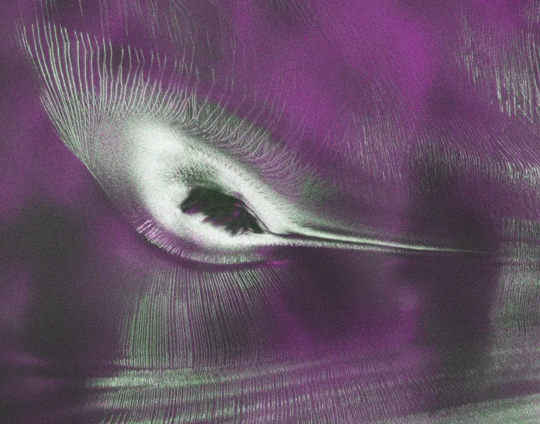
NASA’s hummingbird image is not just a pretty mission poster. It is a useful classroom example because the color comes from radar polarization behavior. In the Nunatak Zaterjavshijsja image, magenta areas mark smoother ice with strong co-polarized radar return, green areas mark fractured or crevassed ice where volume scattering is stronger, and the “wings” trace glacier-flow patterns around the nunatak.[1] That is the same kind of visual reasoning you can practice with a downloaded GCOV scene.
What you are trying to make
Your first defensible output is a map-like radar image of Antarctic ice, not a finished ice-velocity paper. By the end of the workflow, you should have a QGIS project containing an Antarctic NISAR scene, styled as a color composite with HH, HV, and VV polarization bands assigned to red, green, and blue channels. You should also have a short note explaining what the colors probably indicate and what they do not prove.
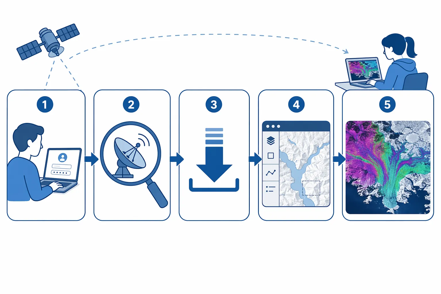
| Part of the workflow | What you do | Why it matters |
|---|---|---|
| Account | Create a free Earthdata Login | NASA data access uses this login even when the data are free |
| Search | Use ASF Vertex or Earthdata Search to find NISAR L2 GCOV over Antarctica | L2 GCOV is the beginner-friendly product for mapped radar visualization |
| Download | Choose one manageable scene after the available June 17, 2026 measurement window | One frame is enough for a first project and avoids drowning your laptop |
| Open | Load the product or its subdatasets into QGIS | The geocoded product should behave more like a map layer than raw radar geometry |
| Style | Assign HH, HV, and VV bands into an RGB composite | This turns a stack of radar measurements into an interpretable ice image |
Use L2 GCOV first, not L1 SLC
The most important choice happens before you download anything. Pick NISAR Level 2 GCOV, short for geocoded covariance, for your first Antarctic ice project. GCOV products are designed for polarimetric analysis in map coordinates, which is exactly what you need for a first color composite. NISAR Level 1 SLC products are available too, but they are meant for more advanced radar workflows such as interferometry and require tools and judgment that usually go beyond a first QGIS project.[2][3]
That distinction saves time. A student who downloads an SLC because it sounds more “raw” or “scientific” may end up with a file that is technically valuable but hard to interpret without additional processing. For a first research artifact, the better question is not “Which product is closest to the satellite?” It is “Which product can I open, map, style, explain, and cite honestly?” For that job, start with L2 GCOV.
- Use L2 GCOV if your goal is a radar color composite, land ice texture interpretation, or a first project map.
- Use L1 SLC later if your goal is interferometry, displacement, or velocity-change analysis and you are ready for Python-based SAR tools such as MintPy or ISCE2.
- Do not claim ice velocity from a single GCOV color image. It can suggest patterns worth studying; it does not measure motion by itself.
Create the Earthdata Login
Start at Earthdata Login. The account is free, and you do not need a university login, a NASA badge, or a special project approval. Use an email address you can access during the download session, confirm the account, and keep the username and password handy for ASF Vertex, Earthdata Search, or any Earthdata-enabled plugin you test in QGIS.
If a browser asks you to approve an application during download, read the page and approve the data-access app only if the domain matches the NASA or ASF tool you are using. Most student download problems are not scientific problems; they are expired login sessions, blocked pop-ups, or a browser that silently refused a redirect.
Find a NISAR L2 GCOV scene over Antarctica
You have two reasonable search doors: ASF Vertex or NASA Earthdata Search. ASF Vertex is often the more comfortable starting point for SAR users because it is built around radar scene search. Earthdata Search is broader and may be better if you are already used to NASA Earthdata collections. NASA’s data-access guidance identifies these routes for NISAR data discovery and download.[2]
In Vertex, look for the search controls rather than the map first. Set the dataset or mission to NISAR if that option is visible. Then narrow the product or processing level to Level 2 GCOV, sometimes written with the full phrase “geocoded covariance.” The NISAR Data User Guide is the source to keep open in another tab when product names look similar, because the difference between SLC and GCOV changes the entire difficulty level of the project.[3]
- Open ASF Vertex or Earthdata Search.
- Search for NISAR products.
- Filter to Level 2 GCOV or geocoded covariance products.
- Draw a search polygon over a part of Antarctica, or use the map to zoom south and select an area of interest.
- Set the date range after June 17, 2026, because the public release covers measurements from that date forward.[1]
- Choose one scene for the first download.
For a first attempt, do not try to download every Antarctic result that appears. One NISAR frame is about 240 km by 240 km, which is already large enough for a meaningful ice-surface visualization.[2] If you are working on a school-issued laptop, choose one scene, name your folder clearly, and save a screenshot or text note of the search filters you used. Reproducibility starts with boring details like date range, product type, and scene name.
Choosing an Antarctic target
If your assignment does not require a specific glacier, pick a scene with obvious visual structure: an ice margin, nunatak, glacier flow feature, crevasse field, or coastline. A blank-looking interior ice sheet scene may still be scientifically useful, but it is harder to explain in a first poster or capstone draft. The hummingbird example works because the radar response changes across recognizable ice textures, not because every Antarctic scene will automatically look dramatic.
If you want to echo the NASA example closely, search around East Antarctica and look for scenes containing exposed rock or nunataks surrounded by glacier ice. You do not need to reproduce the exact hummingbird image to do legitimate student work. A smaller, less photogenic scene can still support a good research question if you document how different polarization channels respond to different ice textures.
Download one scene and keep the files together
After choosing a scene, use the download button or data cart in Vertex or Earthdata Search. Sign in with Earthdata Login when prompted. If the tool offers multiple associated files, download the main product and any metadata files that come with it. Do not scatter the files across Downloads, Desktop, and a cloud-sync folder. Make one project folder with a simple structure such as nisar_antarctica_gcov_project/data_raw and nisar_antarctica_gcov_project/qgis.
Before opening QGIS, write down three things in a notes file: the product level, the acquisition date, and the search tool you used. If your project later becomes a science fair board or capstone report, those notes will matter more than a vague sentence saying you used “NASA data.”
Open the GCOV product in QGIS
Use a current QGIS install. If you plan to use the NASA Earthdata plugin, check the plugin’s current compatibility notes before building your whole workflow around it. The NISAR release is new, and plugin support for NISAR-specific products may still be settling. If the plugin does not recognize your product yet, that is annoying but not fatal: download through ASF Vertex or Earthdata Search in the browser, then open the downloaded raster product or its subdatasets directly in QGIS.
In QGIS, use the Browser panel or Layer menu to add the downloaded product. If the file opens as a container with many subdatasets, do not assume something broke. Radar products often carry several related measurements, quality layers, and metadata fields. You are looking for the polarization layers needed for an RGB composite: HH, HV, and VV, or product variables that clearly correspond to those polarization channels. The exact layer labels may vary, so use the NISAR Data User Guide beside QGIS rather than guessing from the longest filename.[3]
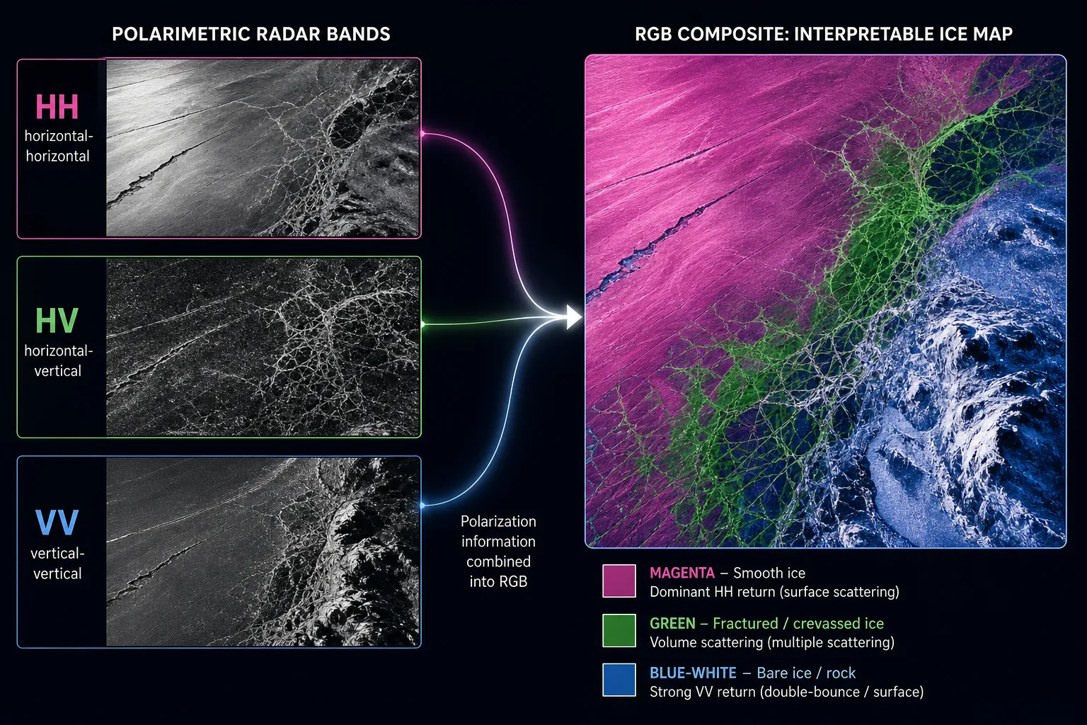
Build the RGB composite
If HH, HV, and VV load as separate grayscale layers, combine them into one virtual raster. In QGIS, the usual path is Raster, then Miscellaneous, then Build Virtual Raster. Add the three polarization layers and choose the option that places each input file into a separate band. Save the virtual raster inside your QGIS project folder, not inside the raw-data folder.
Then style the virtual raster as a multiband color image. Set red to HH, green to HV, and blue to VV. If your product opens as one multiband raster already, skip the virtual raster step and set those bands directly in the layer styling panel. At first, the image may look too dark, too bright, or almost blank. That usually means the stretch is wrong, not that the data are useless.
- Use a multiband color renderer rather than singleband gray.
- Try a cumulative count cut or similar contrast stretch before judging the scene.
- If values are extremely compressed, test a logarithmic-style display stretch if your QGIS setup offers one.
- Turn individual HH, HV, and VV layers on and off to learn what each channel contributes.
- Save the QGIS style once the composite is readable.
This is the moment when the file stops being an unreadable stack of bands. Smooth ice, fractured ice, exposed rock, and flow-related textures may separate into different colors because the three polarization channels respond differently to surface and volume scattering. The NASA hummingbird image used this same kind of polarization contrast to make ice texture visible to a human reader.[1]
What the colors can and cannot tell you
HH means the radar transmitted horizontally polarized energy and received horizontally polarized energy. HV means horizontal transmit and vertical receive. VV means vertical transmit and vertical receive. In an RGB composite where HH is red, HV is green, and VV is blue, bright magenta generally means strong red and blue together, while green means the cross-polarized HV channel is contributing strongly.
For Antarctic ice, that color behavior is useful because NISAR uses L-band radar with a wavelength of about 24 cm, which can operate through cloud cover and is useful for observing snow and ice surfaces in ways optical imagery cannot always manage.[4][5] The mission’s 12-day global revisit cycle and meter-scale imaging capability also make it attractive for semester-length projects, especially when students want repeated observations rather than a single pretty picture.[4][5]
Still, keep your interpretation modest. A green zone in your composite may be consistent with fractured or crevassed ice, especially if it appears where glacier flow should be disrupted. A magenta zone may be consistent with smoother ice. But a first RGB composite does not automatically classify ice types, quantify crevasse depth, or measure speed. It gives you a research artifact you can inspect, annotate, compare with other maps, and use to form a better question.
A simple annotation plan
Once the composite looks readable, add three to five annotations instead of trying to label everything. Mark one area dominated by magenta, one area dominated by green, one transition zone, and one visible flow feature if present. In your notes, describe the evidence carefully: “This area appears greener in the HV channel and may indicate rougher or more fractured ice” is much safer than “This proves the glacier is breaking apart.”
Export a map layout with a title, scale bar, north arrow if appropriate, acquisition date, product name, and a short caption explaining the RGB assignment. A good caption might say that red, green, and blue display HH, HV, and VV radar polarization channels from a NISAR L2 GCOV product. That one sentence prevents a teacher, judge, or lab partner from mistaking the image for natural color.
Reasonable first research questions
After you have one working composite, choose a question that matches the evidence you actually have. The safest early questions are about visualization, texture, and comparison, not precise motion. You can ask how different polarization channels emphasize smooth versus fractured ice, how radar texture changes around a nunatak, or how a NISAR composite compares with an optical basemap where clouds or lighting make interpretation difficult.
- Beginner-friendly: “How do HH, HV, and VV channels differ across smooth and fractured Antarctic ice in one NISAR GCOV scene?”
- Beginner-friendly: “Can a NISAR polarization composite reveal glacier-flow patterns around a nunatak?”
- Intermediate: “Do similar ice-texture zones appear in repeated NISAR scenes over the same area?”
- Advanced: “Can displacement or velocity change be estimated from NISAR SLC data using interferometric processing?”
That last question belongs in a different workflow. It is a good research direction, but it means leaving the first-access QGIS lane and learning SAR processing concepts, phase information, coregistration, and error checking. Tools such as MintPy and ISCE2 can enter there; they do not need to enter your first two-hour GCOV visualization.
If something goes wrong
| Problem | Likely cause | What to try |
|---|---|---|
| You cannot download the file | Earthdata session, redirect, or app authorization issue | Sign out and back in, allow the NASA or ASF authorization prompt, and retry in a fresh browser tab |
| You only see unrelated products | The search is not filtered tightly enough | Set mission to NISAR and product level to L2 GCOV, then redraw the Antarctic search area |
| QGIS shows many subdatasets | The product contains multiple radar layers and metadata | Look specifically for HH, HV, and VV polarization layers and keep the Data User Guide open |
| The image is nearly black | The display stretch is not useful for the radar value range | Adjust min/max, cumulative count cut, or similar contrast settings |
| The plugin does not list NISAR | Plugin support may not yet match the new public release | Download through Vertex or Earthdata Search and open the product manually in QGIS |
| The scene is visually boring | You may have chosen a uniform ice-sheet interior | Try a scene near a nunatak, coastline, glacier margin, or crevasse field |
Where to go after the first image
Once you have made one composite and written a cautious interpretation, the next step is training, not another random download spree. NASA’s SAR education materials, ARSET SAR training, ASF tutorials, and MAAP notebooks can help you move from visual interpretation toward more formal radar analysis.[6][7] MAAP documentation is especially useful if you want to test Python notebooks with sample NISAR-style workflows before committing your own laptop to heavier processing.[7]
For a student project, the first milestone is enough: a real NISAR Antarctic ice radar composite, downloaded through free public access, opened in free GIS software, and explained without pretending it measures more than it does. As of the July 2026 public release, that is a realistic under-two-hour goal for a student with basic QGIS skills. It is also a much better starting point than a slide that says “NASA data is public” and leaves the actual file on someone else’s computer.
References
- US-India Satellite Delivers Data, Reveals Hummingbird in Antarctica, NASA Jet Propulsion Laboratory, July 2026.
- Now That NISAR Launched, Here's What You Can Expect From the Data, NASA Earthdata.
- NISAR Data User Guide, Alaska Satellite Facility.
- NISAR Mission Overview — Quick Facts, NASA Science.
- NISAR Science Users' Handbook, NASA Jet Propulsion Laboratory.
- SAR Education Resources, NASA Science.
- MAAP Documentation, Multi-Mission Algorithm and Analysis Platform.
Related exhibits & inventory
Verified outcomes
Planners
No planner filed for this exam yet
A downloadable timeline template for this exam hasn't been published yet.
Tool verdicts
AI-tool cautions
No AI tools tested for this exam yet
No hands-on AI-accuracy logs have been filed for this exam.
Questions about this plan
Ask a question about a specific section, timeline, or citation in this plan — or flag something that needs correcting.
Comments
Join the discussion with an anonymous comment.