
MCAT, GRE Exam Hub
Learn Survival Analysis for the MCAT and GRE from the Kai Sato Rescue
Survival analysis concepts like Kaplan-Meier curves, censoring, and hazard ratios appear on the MCAT and GRE. This article uses the real-world timeline of the Kai Sato Pacific rescue — departure, mast break, water depletion, and rescue — to make those abstract ideas concrete and test-ready.
- gre
- mcat
- asvab
- sat
- act
- digital-adaptive
- official-material
- section-strategy
- test-date-timeline
Kai Sato’s rescue story already looks like a test passage before anyone adds statistics to it. He departed on June 7, his mast reportedly broke around June 21, his water ran out on July 11, and he was rescued on July 21.[1][2][3][4] Those four dates are enough to build the version of survival analysis an MCAT or GRE student actually needs: a starting point, an event, changing conditions over time, and a graph that can trick you if you read it like an ordinary line chart.
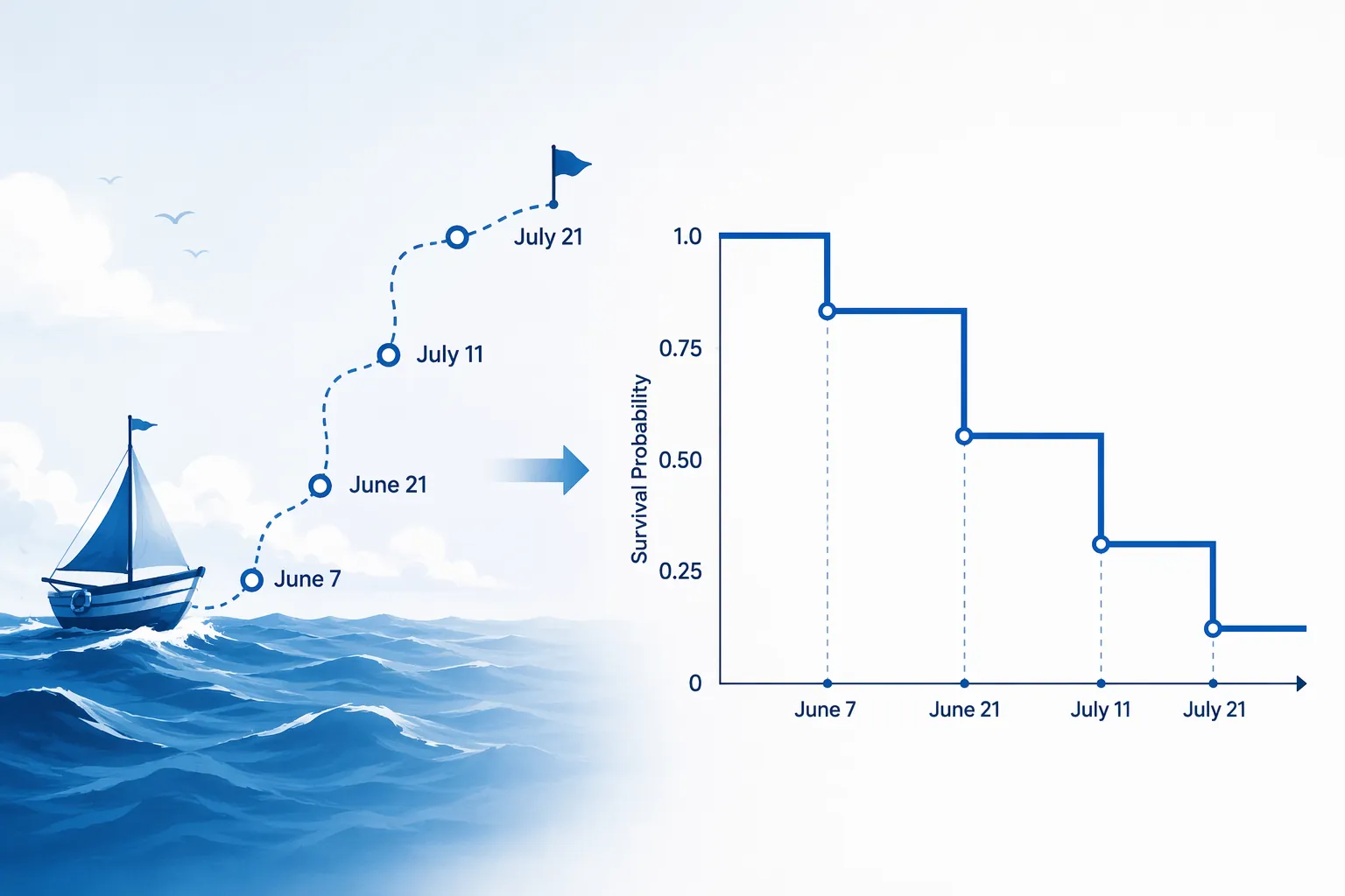
That is the practical reason to learn survival analysis for the MCAT and GRE. Not because either exam is trying to turn you into a biostatistician, and not because every form must include Kaplan-Meier curves. The safer claim is narrower: time-to-event graphs can appear in clinical research passages, observational-study prompts, and data-interpretation sets, and students who only drilled t-tests and chi-square tables are more likely to misread them.
The key move is to stop treating survival analysis as a vocabulary list. Kaplan-Meier, censoring, hazard, proportional hazards: those words mean very little until the test gives you a clock and asks what happened before the clock stopped.
Start With the Clock, Not the Formula
In survival analysis, the first question is not “What test do I run?” It is “When does observation begin?” StatPearls describes survival analysis as a set of methods for studying the time until an event occurs, especially when not every subject has the event during the observation window.[5] In the Sato timeline, the natural time origin is June 7, the date of departure.
| Timeline Element | Date | Exam-facing interpretation |
|---|---|---|
| Departure | June 7 | Day 0, the time origin |
| Mast break | Around June 21 | A changing condition, not automatically the event |
| Water depletion | July 11 | Another changing condition that may affect risk |
| Rescue | July 21 | The event, if the study defines rescue as the endpoint |
If June 7 is day 0, then July 21 is day 44. The news coverage also uses the phrase “30 days adrift,” which is not the same measurement window as departure-to-rescue.[1][2] A reasonable reconciliation is that “30 days adrift” refers roughly to the period after the mast broke around June 21, while “44 days” counts from departure to rescue. For an exam passage, that distinction matters. A question can punish you for using the dramatic phrase instead of the defined time origin.
Once the time origin is fixed, the next question is the event. In this worked model, define the event as rescue. That means Sato’s observed event time is day 44. The mast break and water depletion are not events in this model; they are time-varying conditions that may change the chance of what happens next.
What a Kaplan-Meier Curve Would Actually Step On
A Kaplan-Meier curve is a step function used to estimate the probability that subjects remain event-free beyond a given time.[5][6] If the event is rescue, then the curve represents the proportion of people not yet rescued. The curve does not slide downward every day just because time passes. It steps downward only when an event occurs.
That point is where many test mistakes begin. In the Sato case, a graph should not automatically step down at the mast break or at water depletion if rescue is the defined event. Those moments may change risk, but they are not rescue. If a test stem says the endpoint is “rescue,” the step belongs on July 21, not June 21 or July 11.
For one person, the curve is almost too simple: it stays at 1.0, meaning “not yet rescued,” until the rescue occurs, and then it drops. Real Kaplan-Meier graphs become interesting because there are many subjects. If 10 sailors begin observation and 1 is rescued on day 20, the estimated proportion still not rescued drops from 10/10 to 9/10 at day 20. If another is rescued on day 30, it drops again. The Statsandr worked-example approach is useful here because it makes the calculation visible: at each event time, the curve is updated using the number at risk immediately before the event and the number of events at that time.[7]
You do not need to memorize a long derivation for most MCAT or GRE purposes. You do need to recognize the logic: flat segments mean no observed event occurred during that interval; downward steps mean events occurred; the size of the step depends on how many people were still being followed just before the event.
A Mini Kaplan-Meier Translation
| If the passage says... | A strong test-reader thinks... |
|---|---|
| The boat left on June 7. | That is probably day 0 unless the stem defines another baseline. |
| The mast broke around June 21. | This may change risk, but it is not a step in the curve unless mast failure is the event. |
| Water ran out on July 11. | This is a time-dependent condition; watch whether the question asks about hazard. |
| Rescue occurred on July 21. | If rescue is the endpoint, this is the observed event time. |
| Some subjects were lost before rescue. | Those subjects are censored, not counted as rescued or as never capable of rescue. |
Censoring Is Not “Nothing Happened”
Censoring is the survival-analysis idea students most often flatten into the wrong answer. A censored observation is one where the exact event time is unknown, even though the subject contributed valid time under observation.[5][6] Censoring does not mean the subject had the event. It also does not mean the subject is irrelevant.
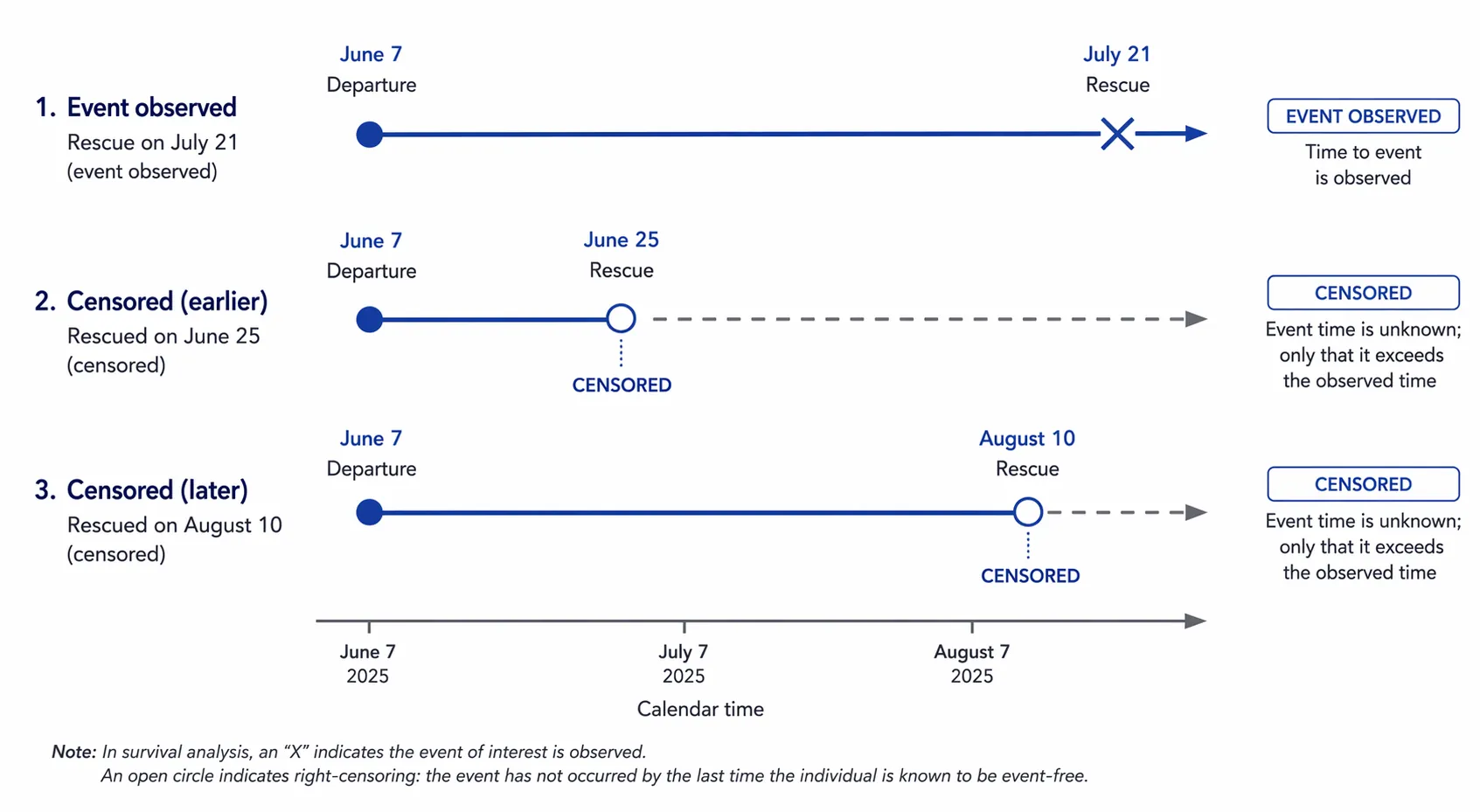
Use a hypothetical extension of the Sato case. Suppose a study followed several small-vessel voyages from departure until rescue, withdrawal from tracking, or the end of a 60-day observation period. One sailor is rescued on day 44. Another’s satellite tracker stops transmitting on day 25, and the researchers never learn whether rescue occurred later. A third is still at sea when the 60-day study window closes. The second and third sailors are censored at different times.
Those censored sailors still matter before their censoring time. The day-25 sailor was genuinely observed from day 0 through day 25. The day-60 sailor was genuinely observed through day 60. What the analysis cannot do is pretend to know their exact rescue times after observation stops.
On a Kaplan-Meier graph, censoring is often marked with a small tick on the curve rather than a downward step. That visual convention is not decoration. A tick means the subject left the risk set at that time without an observed event. A downward step means an event occurred. If an answer choice treats censoring as proof of survival forever, proof of failure, or proof of no risk, it is overclaiming.
Hazard Is About the Next Moment, Not the Whole Story
Hazard is usually introduced badly because it sounds like a synonym for danger. In survival analysis, hazard refers to the instantaneous rate at which the event occurs among subjects who have not yet had the event.[5] That definition matters because the event can be rescue, death, relapse, equipment failure, hospital discharge, or anything else the study defines.
If the event is rescue, the hazard is the moment-by-moment chance of being rescued among those not yet rescued. The mast break could plausibly change that chance in either direction depending on the passage: it might make travel impossible and increase dependence on external rescue, or it might reduce visibility and communication. The reported facts do not support a precise causal claim about the mast break, so an exam-safe interpretation would say only that the condition changed.
If the event is death or medical collapse, the hazard means something else entirely. Running out of water on July 11 would then be a condition that could increase immediate risk. But it still would not equal the event unless the study defined water depletion itself as the endpoint. The event definition controls the graph.
A hazard ratio compares hazards between groups. A ratio above 1 means the event is occurring at a higher instantaneous rate in the numerator group; a ratio below 1 means it is occurring at a lower instantaneous rate. The trap is that “higher” is not automatically good or bad. If the event is rescue, a higher hazard of rescue sounds favorable. If the event is death, a higher hazard sounds unfavorable.
How This Becomes an MCAT or GRE Question
The MCAT version is most likely to hide survival analysis inside a research passage. You may see a clinical study comparing treatment groups, a graph with stair-step curves, censored subjects marked by ticks, and a question asking which conclusion is best supported. The AAMC describes MCAT Scientific Inquiry and Reasoning Skills as including interpretation of data, research design, and conclusions from scientific evidence.[8] That skill framing is broad enough for time-to-event graphs, even if survival analysis is not something to expect on every exam.
The GRE version is usually less biological and more data-interpretive. A quantitative reasoning set may give a graph or table and ask what can be inferred, which group has the greater probability of remaining event-free at a given time, or how many subjects were still under observation. ETS describes GRE Quantitative Reasoning as assessing the ability to interpret and analyze quantitative information.[9] A Kaplan-Meier curve fits that job description cleanly.
In either setting, the answer is usually not hidden in advanced modeling. It is hidden in the axes, the endpoint definition, and the difference between an event and a censored observation.
- Check the time origin before calculating elapsed time.
- Identify the event exactly as the passage defines it.
- Treat flat curve segments as intervals with no observed events, not intervals with no risk.
- Treat censoring marks as incomplete event-time information, not as failures or successes.
- Interpret hazard ratios in the direction of the event, not in the direction that sounds emotionally positive.
A Test-Style Reading of the Sato Timeline
Imagine a passage that defines the endpoint as successful rescue after departure. It gives the same four dates: June 7 departure, mast break around June 21, water depletion July 11, and rescue July 21. The cleanest answer is that the observed time to event is 44 days from departure to rescue. If another answer says 30 days, it may be using the “adrift” window instead of the study’s defined baseline.
Now imagine the passage defines endpoint as equipment failure. The event changes. The mast break around June 21 becomes the approximate event time, and rescue becomes a later outcome rather than the survival-analysis endpoint. Same story, different statistical object.
Now imagine the passage defines endpoint as death during an emergency voyage. Sato would not be an event case in that model because he was rescued alive, based on the reported rescue timeline.[1][2][3][4] Depending on the study window, he might be classified as event-free through rescue, removed from further risk at rescue, or censored if the study stops following him at that point. The correct label depends on the exact design stated in the passage.
That last sentence is not a dodge. It is the test skill. Survival-analysis questions often reward the student who refuses to import an endpoint that the passage did not define.
What Not to Overlearn
There is a deeper version of this topic involving Cox proportional hazards models, assumptions about proportional hazards, confidence intervals around survival estimates, and formal tests comparing curves. Those topics matter in biostatistics. They are not usually the first thing an MCAT or GRE student needs when facing a graph under time pressure.
For exam readiness, the priority is smaller and sharper. You should be able to tell what the x-axis measures, what the y-axis estimates, which marks are events, which marks are censored observations, and whether a statement about risk is talking about cumulative probability or instantaneous hazard.
The Kai Sato rescue works as a compact mental model because it gives you dates you can hold in working memory. June 7 starts the clock. Around June 21 changes the conditions. July 11 changes them again. July 21 ends the rescue timeline. From there, a test maker can ask almost everything that matters at the introductory level.
If you want another real-world passage frame, the related Bald Eagle rehab case-study article gives a similar bridge from concrete events to MCAT-style data reading. After that, move back into MCAT and GRE passage practice with one extra habit: whenever a graph has time on the x-axis and a step-shaped curve, pause long enough to ask what event the curve is actually counting.
References
- Kai Sato rescue coverage, NY Post
- Kai Sato rescue coverage, The Independent
- Kai Sato rescue coverage, Newser
- Kai Sato rescue coverage, KRQE
- Survival Analysis, StatPearls - NCBI Bookshelf
- Survival Analysis 101, PMC
- Survival analysis worked examples, Statsandr
- What is tested on the MCAT exam?, AAMC
- GRE General Test Content and Structure, ETS
Related exhibits & inventory
Verified outcomes
No verified outcomes on file for this exam yet
See Methodology for how outcome evidence is disclosed once logged.
Planners
No planner filed for this exam yet
A downloadable timeline template for this exam hasn't been published yet.
Tool verdicts
AI-tool cautions
No AI tools tested for this exam yet
No hands-on AI-accuracy logs have been filed for this exam.
Questions about this plan
Ask a question about a specific section, timeline, or citation in this plan — or flag something that needs correcting.
Comments
Join the discussion with an anonymous comment.