
GRE Exam Hub
Key 2025 Global Climate Report Numbers Every Test-Taker Should Know
This study guide extracts the five most exam-relevant headline figures from the NOAA and WMO 2025 global climate reports — temperature anomalies, sea ice, ocean heat, extreme events — and organizes them so GRE, SAT, ACT, and MCAT candidates can quickly recognize and cite them in reading comprehension, science-reasoning, and data-graph items.
- SAT
- ACT
- GRE
- MCAT
- ASVAB
- digital-sat
- adaptive-testing
- registration-fee
- content-outline
- score-target
The first trap in any global climate report 2025 study guide is the temperature number. “2025 was 1.17°C warmer” and “2025 was about 1.43°C warmer” can both be correct, but they are not interchangeable. NOAA reports 2025 as 1.17°C, or 2.11°F, above the 20th-century average; WMO frames 2025 at about 1.43°C above the pre-industrial level.[1][2] A test-maker does not need to invent a hard question here. The wrong answer can simply attach the right number to the wrong baseline.
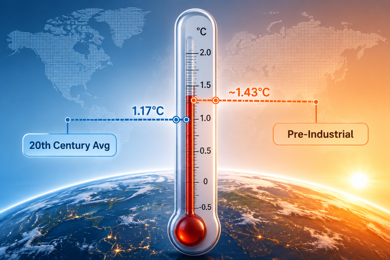
That baseline distinction also explains the ranking language. NOAA ranks 2025 as the 3rd-warmest year in its 176-year record, while WMO describes 2025 as likely the 2nd- or 3rd-warmest year depending on the dataset used.[1][2] For exam purposes, do not smooth those into a single master ranking. If a passage says NOAA, use NOAA’s ranking and baseline. If it says WMO, expect pre-industrial framing and dataset-dependent ranking language.
The five figures worth memorizing first
These are the numbers most likely to survive into a standardized-test passage because they are compact, sourceable, and easy to turn into comparison, ranking, or graph-reading questions.
| Finding | Exam-ready number | Source framing | Likely test use |
|---|---|---|---|
| Annual temperature anomaly | 1.17°C / 2.11°F above the 20th-century average; 3rd-warmest year in NOAA record | NOAA baseline: 20th-century average | Reading comprehension, graph labels, answer-choice precision |
| Pre-industrial temperature comparison | About 1.43°C above pre-industrial level; 2025 was 2nd/3rd warmest depending on dataset | WMO baseline: pre-industrial | Evidence comparison, baseline distinction, methodology wording |
| Ocean heat content | Upper ocean heat content reached a record high for the 5th consecutive year; ocean heat uptake was about 18 times annual human energy use | NOAA for consecutive record; WMO for energy-use comparison | Science reasoning, scale comparison, trend interpretation |
| Arctic sea ice | Annual average extent was 3.93 million square miles, the 2nd lowest on record; annual maximum extent was the lowest on record | NOAA sea ice ranking | Data-graph interpretation, rank vs. absolute value |
| Tropical cyclones | 101 named tropical storms globally, above the 1991–2020 average of 88; Atlantic had 3 Category 5 hurricanes | NOAA tropical cyclone count | Table reading, comparison to average, regional vs. global distinction |
| Continental warmth | Every continent ranked among its 10 warmest years | NOAA continental rankings | Quick recognition datum in passage context |
The table includes six rows because the temperature finding splits into two exam-relevant forms. The core memorization task is still fivefold: temperature, ocean heat, sea ice, tropical cyclones, and continental warmth. Temperature simply carries the most dangerous citation trap.
Temperature: the number is only half the answer
NOAA’s headline figure is clean but baseline-specific: the 2025 global surface temperature was 1.17°C, or 2.11°F, above the 20th-century average, making it the 3rd-warmest year in NOAA’s record.[1] If a graph axis is labeled “departure from 20th-century average,” this is the number to retrieve.
WMO’s headline comparison answers a different question. It places 2025 at about 1.43°C above the pre-industrial level and identifies 2015–2025 as the hottest 11-year period on record.[2] That makes WMO language more likely to appear in passages about long-term warming thresholds, international climate reporting, or multi-dataset synthesis.
A realistic wrong answer would say that NOAA found 2025 was about 1.43°C above the 20th-century average. Another would say WMO ranked 2025 exactly 3rd warmest without the dataset qualification. Both errors are small enough to look harmless and large enough to cost the point.
- If the passage cites NOAA NCEI, think: 1.17°C / 2.11°F above the 20th-century average; 3rd warmest.
- If the passage cites WMO, think: about 1.43°C above pre-industrial levels; 2nd/3rd warmest depending on dataset; 2015–2025 hottest 11-year span.
- If an answer choice gives a temperature anomaly without naming the baseline, treat it as incomplete.
Ocean heat: the best science-reasoning number in the set
Ocean heat content is the figure most likely to reward students who read trends rather than headlines. NOAA reports that upper ocean heat content reached a record high in 2025 for the 5th consecutive year.[1] WMO adds a scale comparison: the ocean absorbs heat at a rate estimated at about 18 times annual human energy use.[2]

Those two facts do different jobs. “5th consecutive year” is a trend statement. It tells you that 2025 was not just high in isolation; it extended a record sequence. “About 18 times annual human energy use” is a scale comparison. It helps a passage translate heat uptake into a magnitude readers can compare, but it should not be mistaken for a claim about direct human energy consumption causing that exact amount in a simple one-to-one way.
In a science-reasoning item, this could appear as a graph of ocean heat content by year, with answer choices asking which conclusion is best supported. The supported conclusion would be narrow: the upper ocean heat content series reached a record high for the 5th consecutive year. It would not automatically support a broader claim about every ocean depth, every region, or every possible climate variable unless the passage supplies that evidence.
Sea ice: keep extent, rank, and season separate
NOAA gives the Arctic sea ice annual average extent as 3.93 million square miles, ranking 2025 as the 2nd lowest annual extent on record. NOAA also reports that Arctic sea ice reached its lowest annual maximum extent on record.[1] These are adjacent facts, not duplicates.
That distinction matters because graph questions often change the measure. Annual average extent is not the same as annual maximum extent. A student who remembers only “2nd lowest” may miss a question asking about the maximum, where the relevant phrase is “lowest on record.”
- Annual average Arctic sea ice extent: 3.93 million square miles.
- Annual average rank: 2nd lowest.
- Annual maximum extent: lowest on record.
Storm counts: global total first, Atlantic detail second
NOAA reports 101 named tropical storms globally in 2025, above the 1991–2020 average of 88.[1] That is the global comparison. The Atlantic detail is separate: the basin had three Category 5 hurricanes, the second-highest single-year count since 2005.[1]
The easy error is to mix the scale of the claim. “101 named storms” is global. “Three Category 5 hurricanes” is Atlantic. “Above average” refers to the 101 compared with the 88 average. A table-based question could place those figures in adjacent rows and ask which statement accurately combines them.
Continental warmth: useful, but not worth overbuilding
Every continent ranked among its 10 warmest years in 2025, according to NOAA.[1] This is not the most technical figure in the set, but it is a good reading-comprehension marker. It can support a passage-level claim that warmth in 2025 was broadly distributed across continents, provided the claim stays at that level.
Do not stretch it into a claim that every continent had the same rank, the same anomaly, or the same climate impacts. “Top 10 warmest” is a ranking bucket, not a full regional analysis.
One emerging figure to watch: Earth energy imbalance
WMO also highlights Earth energy imbalance as a new indicator and reports that it reached the highest level in 65 years.[2] This is not as likely to be the first number a student needs to memorize as the temperature anomaly or ocean heat record, but it has the right shape for a future exam passage: a newer metric, a long comparison window, and a term that requires careful interpretation.
If it appears, expect the question to test what the indicator measures in context, not whether the phrase sounds alarming. The safer habit is to identify the measured quantity, the time window, and the institutional source before choosing an answer.
How these numbers usually turn into exam questions
Standardized exams rarely ask students to recite a climate report from memory. They use report numbers as material for source evaluation, graph interpretation, and careful comparison. That means the useful study habit is not just memorizing a figure; it is storing the figure with its source, baseline, rank, and measurement type.
| If the item asks... | Look for... | Common trap |
|---|---|---|
| Which statement best summarizes the temperature data? | Baseline and source: NOAA 20th-century average vs. WMO pre-industrial level | Treating 1.17°C and ~1.43°C as interchangeable |
| Which conclusion is supported by the ocean heat graph? | Record-high upper ocean heat content for the 5th consecutive year | Generalizing beyond the measured ocean layer or data shown |
| Which sea ice statement is accurate? | Annual average extent vs. annual maximum extent | Using “2nd lowest” for both measures |
| Which storm comparison is valid? | Global named storms compared with global average; Atlantic Category 5 count as basin detail | Combining global and regional claims as if they used the same denominator |
| Which evidence best supports broad geographic warmth? | All continents in top 10 warmest years | Inferring identical continental anomalies or impacts |
For SAT and ACT science-style items, the baseline and graph-axis labels usually do the work. For GRE reading comprehension, watch the author’s wording around ranking and certainty. For MCAT-style passages, ocean heat and energy imbalance are especially plausible because they combine measurement, systems thinking, and scale comparison. MCAT students using spaced repetition can turn these into compact cards; the broader study setup is covered in How to Use Anki for the MCAT.
Students comparing different climate-related passages may also want the separate guide to the National Academies climate report explained for students. That report is useful for a different kind of test passage: legal and scientific consensus language rather than NOAA/WMO headline data.
The retrieval rule
When a 2025 climate figure appears in a passage, run the same check every time: source, baseline, number, rank or trend, and measurement type. NOAA’s 1.17°C above the 20th-century average and WMO’s about 1.43°C above pre-industrial levels are not competing memories; they are different answers to different source-framed questions. The scoring advantage is knowing which one the passage is actually asking for.
References
- Annual 2025 Global Climate Report, NOAA National Centers for Environmental Information, January 14, 2026.
- State of the Global Climate 2025, World Meteorological Organization, March 23, 2026.
Related exhibits & inventory
Verified outcomes
Planners
No planner filed for this exam yet
A downloadable timeline template for this exam hasn't been published yet.
Tool verdicts
AI-tool cautions
No AI tools tested for this exam yet
No hands-on AI-accuracy logs have been filed for this exam.
Questions about this plan
Ask a question about a specific section, timeline, or citation in this plan — or flag something that needs correcting.
Comments
Join the discussion with an anonymous comment.